PRODUCT MANAGEMENT / USER EXPERIENCE / USER INTERFACE / VISUAL DESIGN
Partner Workload Tool
Ernst & Young (EY) is a multinational professional services firm headquartered in London, and is one of the largest firms of its kind in the world. Along with Deloitte, KPMG and PricewaterhouseCoopers, it is considered one of the Big Four accounting firms. EY operates as a network of member firms which are structured as separate legal entities in a partnership, which has over 300,000 employees and over 700 offices in 150 countries around the world.
Background
This product is a utilization tool that EY partners will use to track their project hours based on their yearly budget estimates.
My role was to assist the business and development teams in designing the product from start to finish. I was accompanied by a Junior UX designer, a recent graduate of Cornell, and my goal was to mentor and educate her on best UX practices as well as to educate and manage external teams on expectations from UX going forward.
The timeline for this Sprint Zero was 2 weeks and included stockholder interviews, a two-day workshop in Dallas, TX and working sessions on insights generated during the discovery phase. All of the findings were presented to client stakeholders and EY leadership for approval.
Discovery Process.
WORKSHOPS
Two-day onsite meetings to learn about client business models and address key UX and technology risks.
STAKEHOLDER INTERVIEWS
We conducted 8 interviews and initiated an ongoing dialog with local client stakeholders and EY subject experts.
PRODUCT AUDIT
A thorough audit was conducted to examine all the features and functionalities of the existing product.
DESIGN SPRINTS
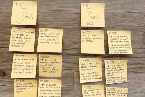
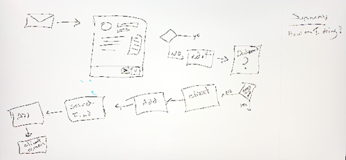
Sprint Zero brainstorming sessions were established to distill the product and its purpose. Baseline UX deliverables and tests were created to establish the best product experience.
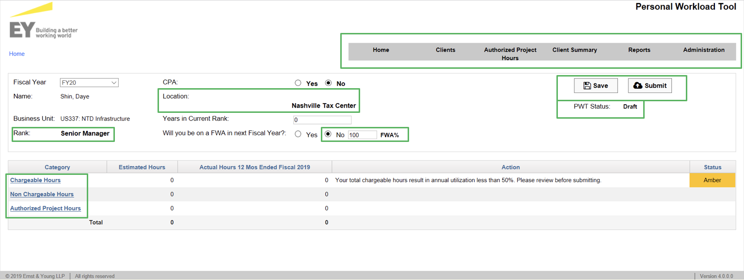
Legacy Product Audit
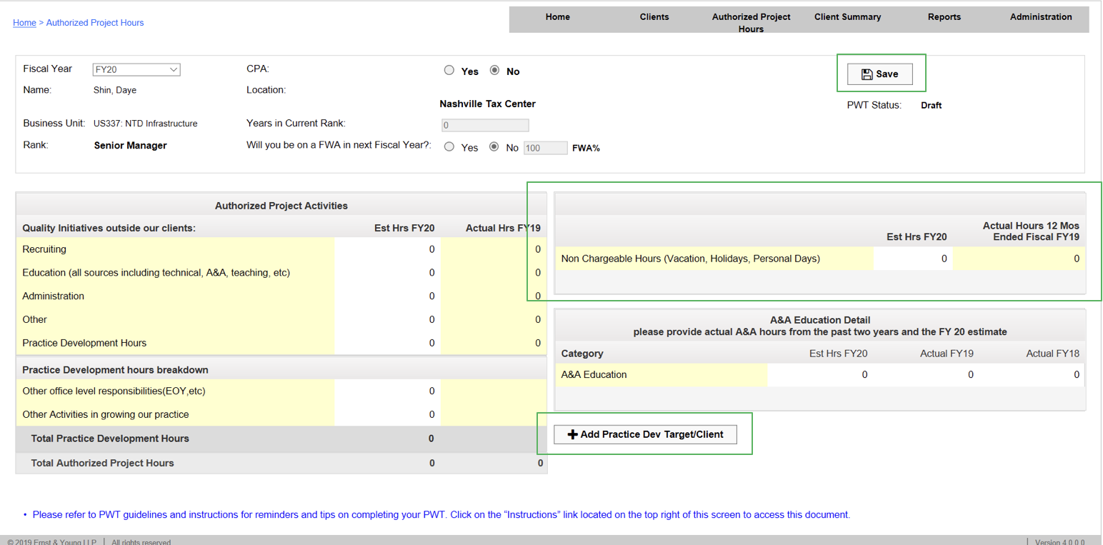
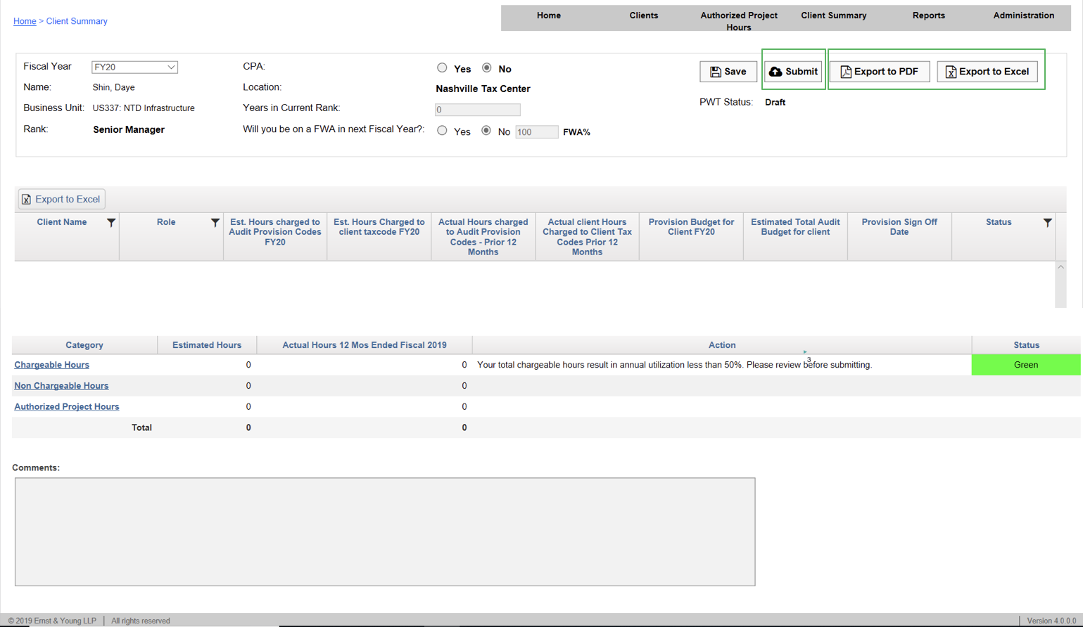
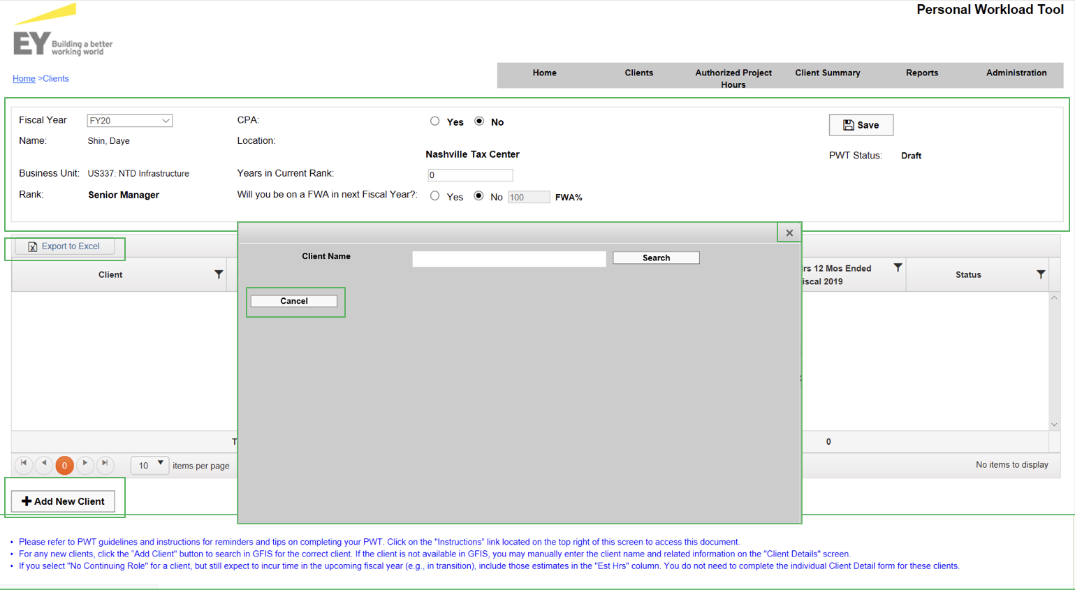
The legacy product was lacking in many ways. Elements were placed randomly on many pages with no form of hierarchy or intuitive functionality. Many pages had elements that were unrelated to the topic on the page. For instance, the Client Summary page included My Profile information on the top of the page. The UI was cluttered, inconsistent, and not built with accessibility in mind.
Working Sessions
PROBLEMS IDENTIFIED
Too many clicks
Too much work done outside of PWT
Lack of education and documentation
No responsive design (especially for tables)
No notification system
No reminders
No white space
Cluttered design
No information hierarchy
Confusing UI
No focus
Manual process for adding users
Redundancy (user profile on multiple screens)
Inconsistency
No predictive search
Location of call-to-action buttons
Misleading tab names
Lack of visual overview
IDENTIFIED PRODUCT
What is this product and what is its value?
What is the problem we are attempting to solve?
Who uses this product and why?
Identifying an elevator pitch: “Can you tell me what it is in a sentence or two?”
WHAT IS THE PRODUCT?
Its utilization management tool that optimizes, provides transparency, and holds accountability of partners’ hours.
Empathy
COHORT REFINEMENT
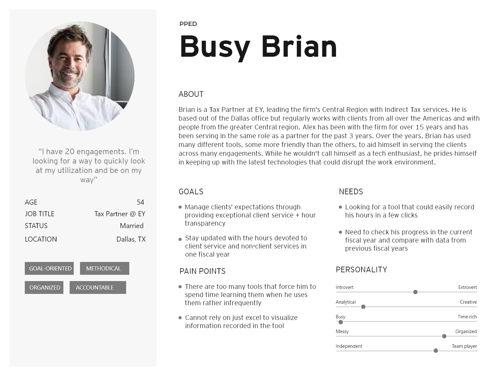
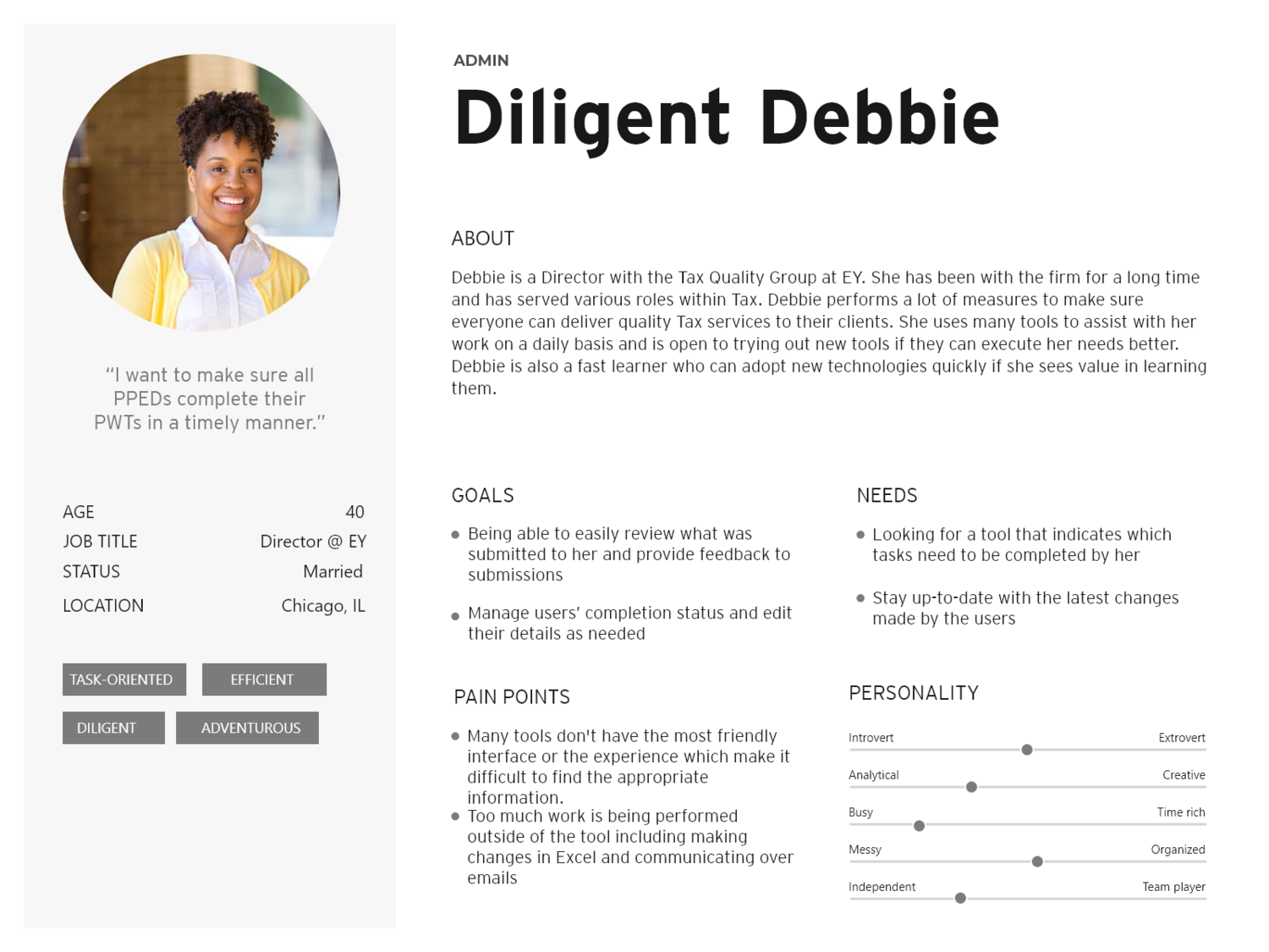
In this project 5 roles were identified unique roles. During our process we dondenced these roles into 2 manageable personas. These personals were ease for all stakeholders to relate to and made it ease to retain and thus emphasize with during our build.
5 Roles
2 Personas
PERSONAS
KEY TAKEAWAYSDoes not want to live in the product
Would like to view his status as quickly as possible
Wants to enter his hours with as few clicks as possible
KEY TAKEAWAYSSpends a lot of time in the tool
Would like see any outstanding items that require immediate attention
Needs to make changes within the tool as quickly as possible
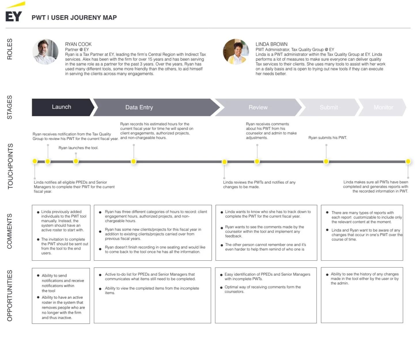
JOURNEY MAP
KEY TAKEAWAYS Transparency of activity history within the tool
Easy identification of outstanding tasks and PPEDs with incomplete status
Too much work is done outside of the tool via Excel and email communication
PRODUCT DESIGN OKR/KPI
Cut admin operating hours
Increase User completion rate.
Cut number of emails sent by 50% from previous year.
Auto fill as much as possible with the information we know and can predict.
Decrease support emails by 80% (20 hours) a year.
Provide more education about business processes on product pages.
Prepare checklist for the users before they enter the portal.
Review the need to use Excel for reports.
Enable custom templates.
Build scheduled reports.
Provide clean printable PDF versions.
Enable Power BI for quick slicing of data.
Sprint Zero Mockups
RESPONSIVE LAYOUT
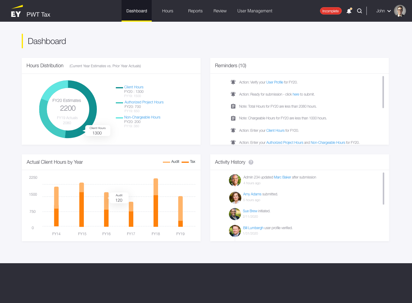
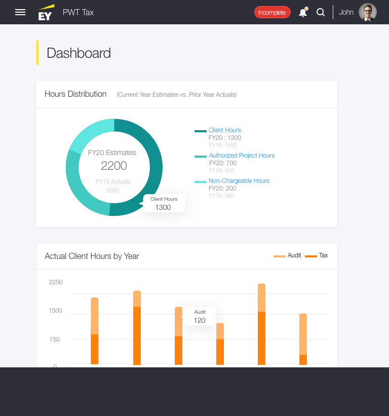
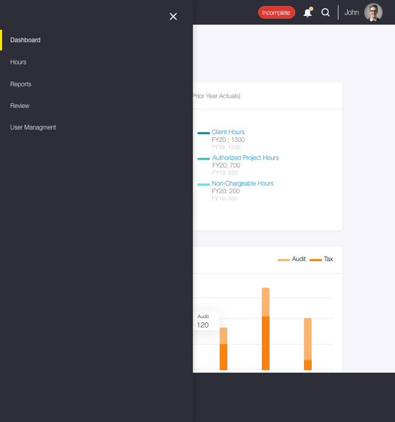
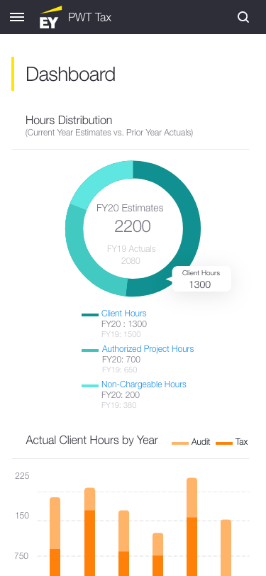
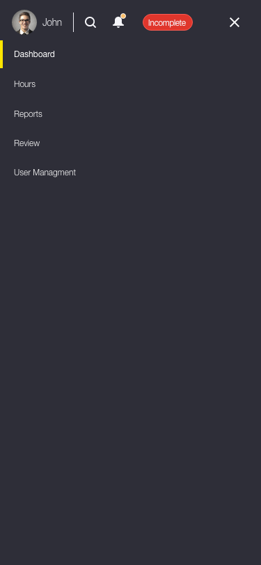
This image gallery is showing how the pages will look at the 3 break points.
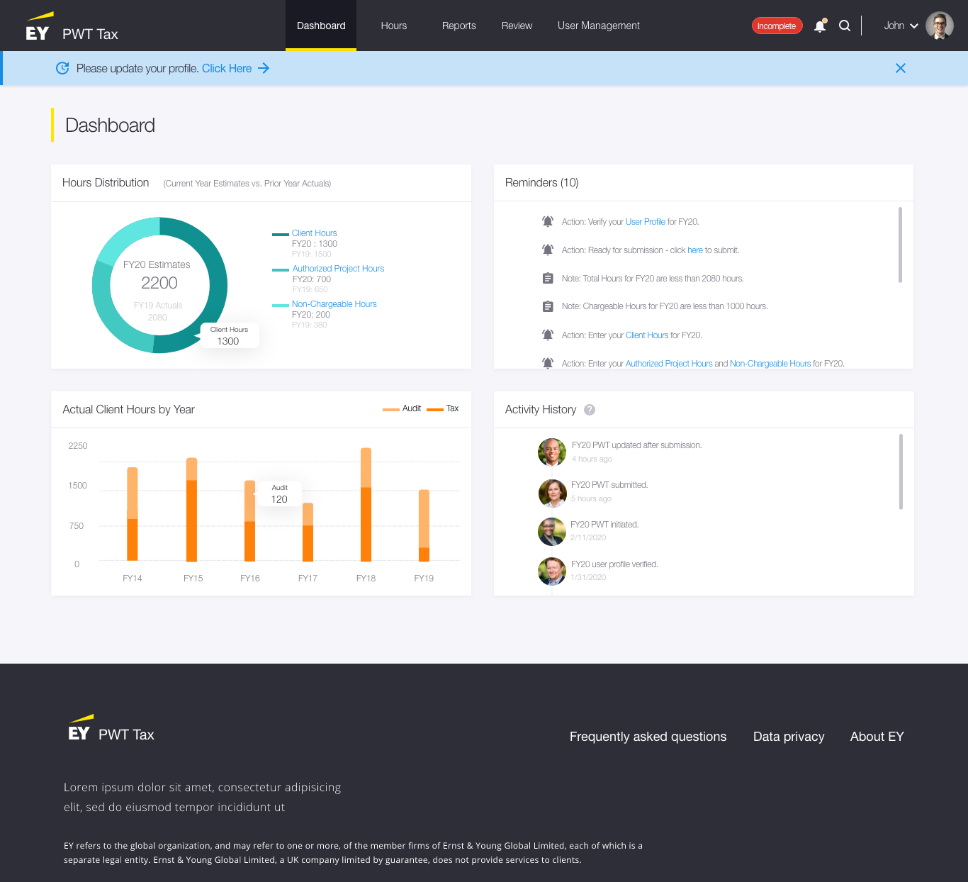
Desktop version
Med (tablet version)
Med (tablet version) - with navigation
Small (mobile version)
Small (mobile version) - with navigation
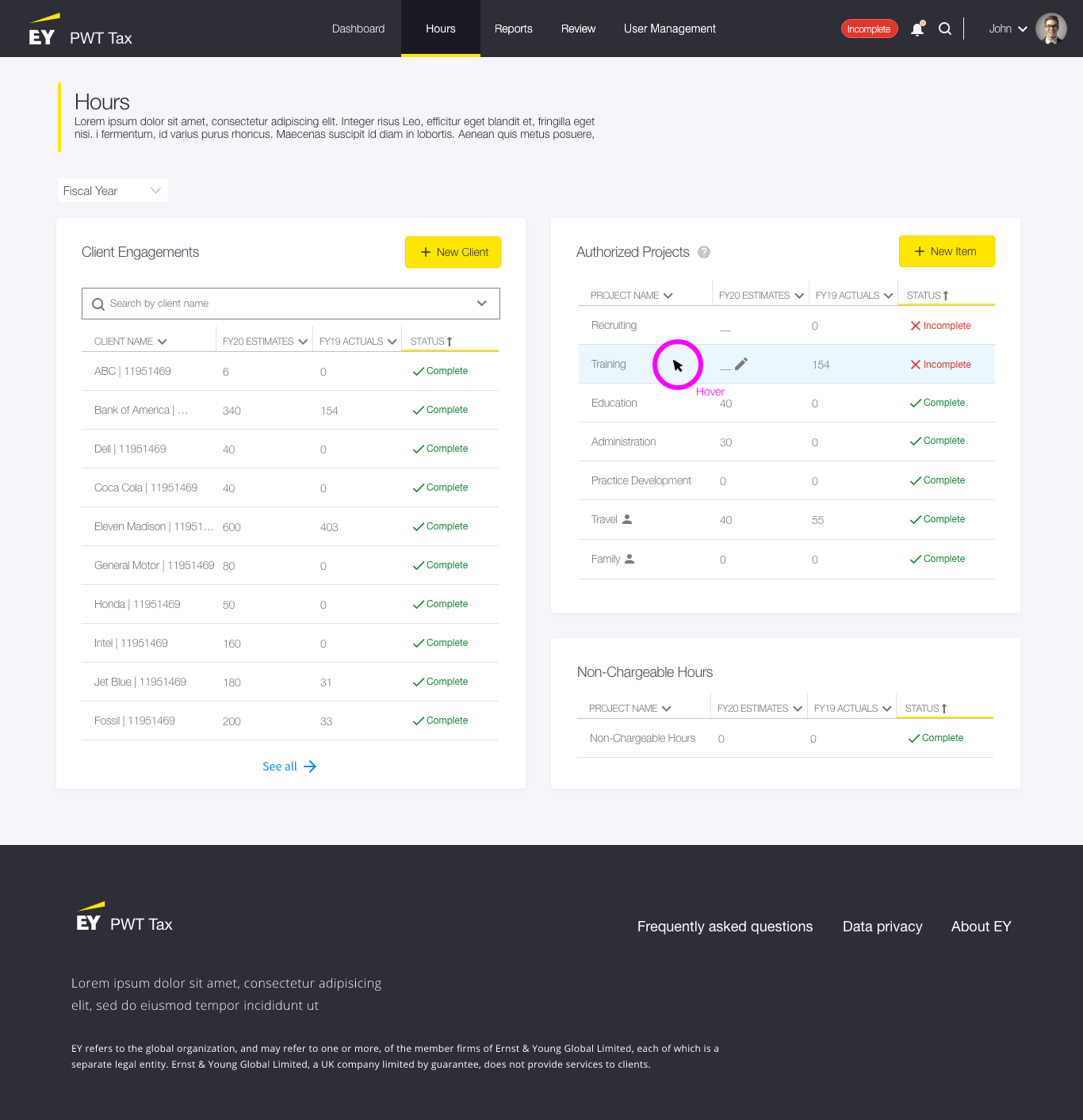
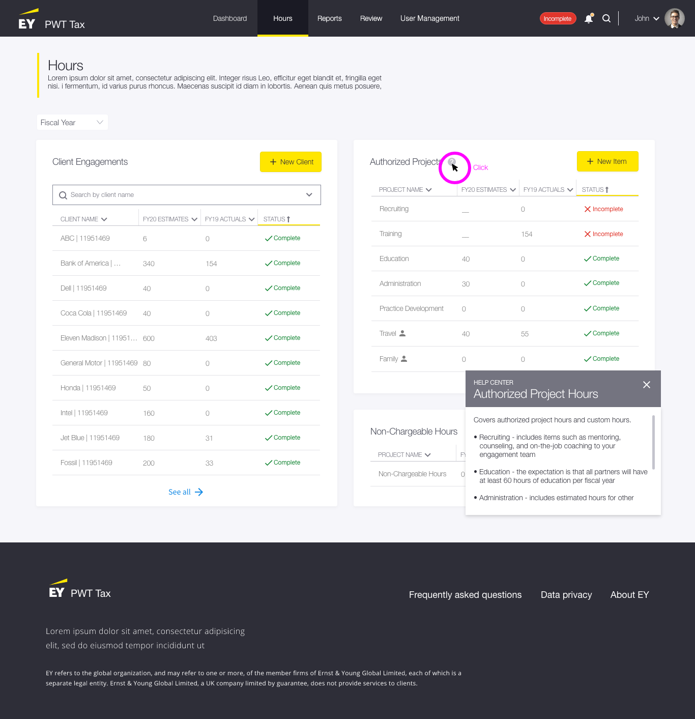
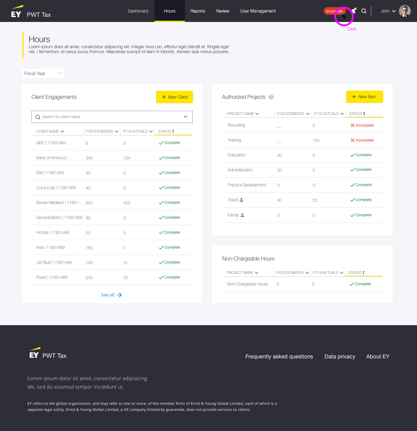
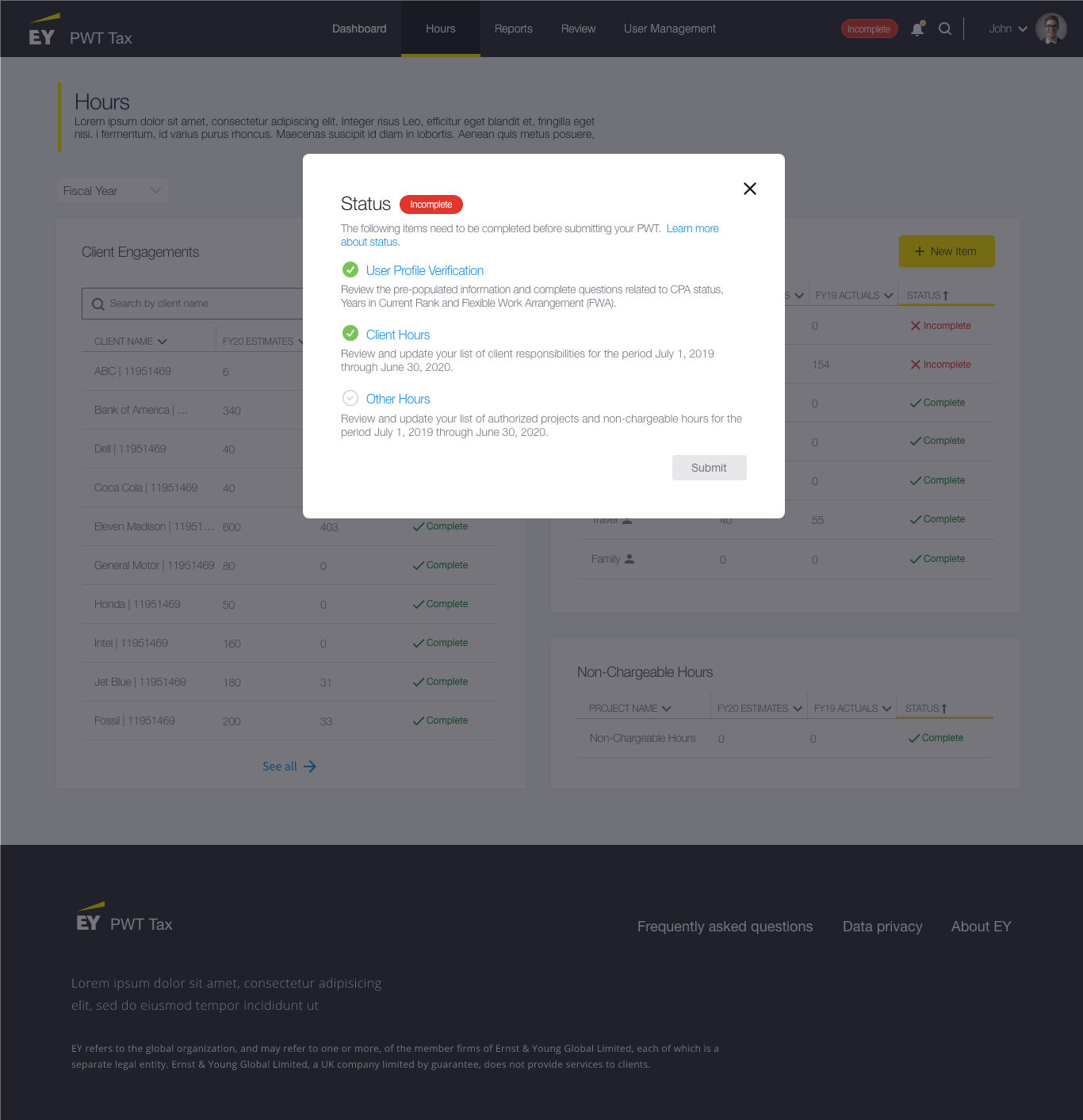
VISION MOCKUPS
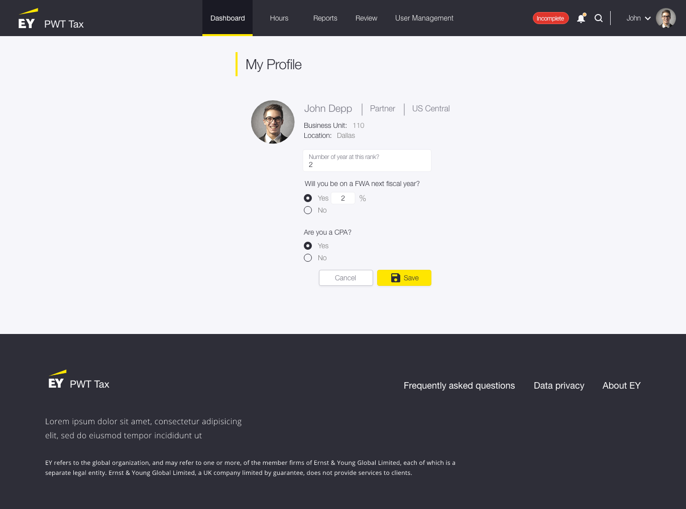
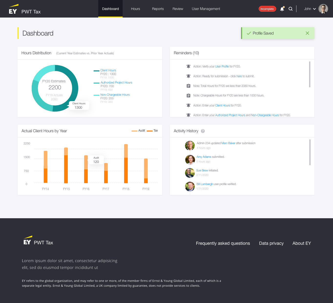
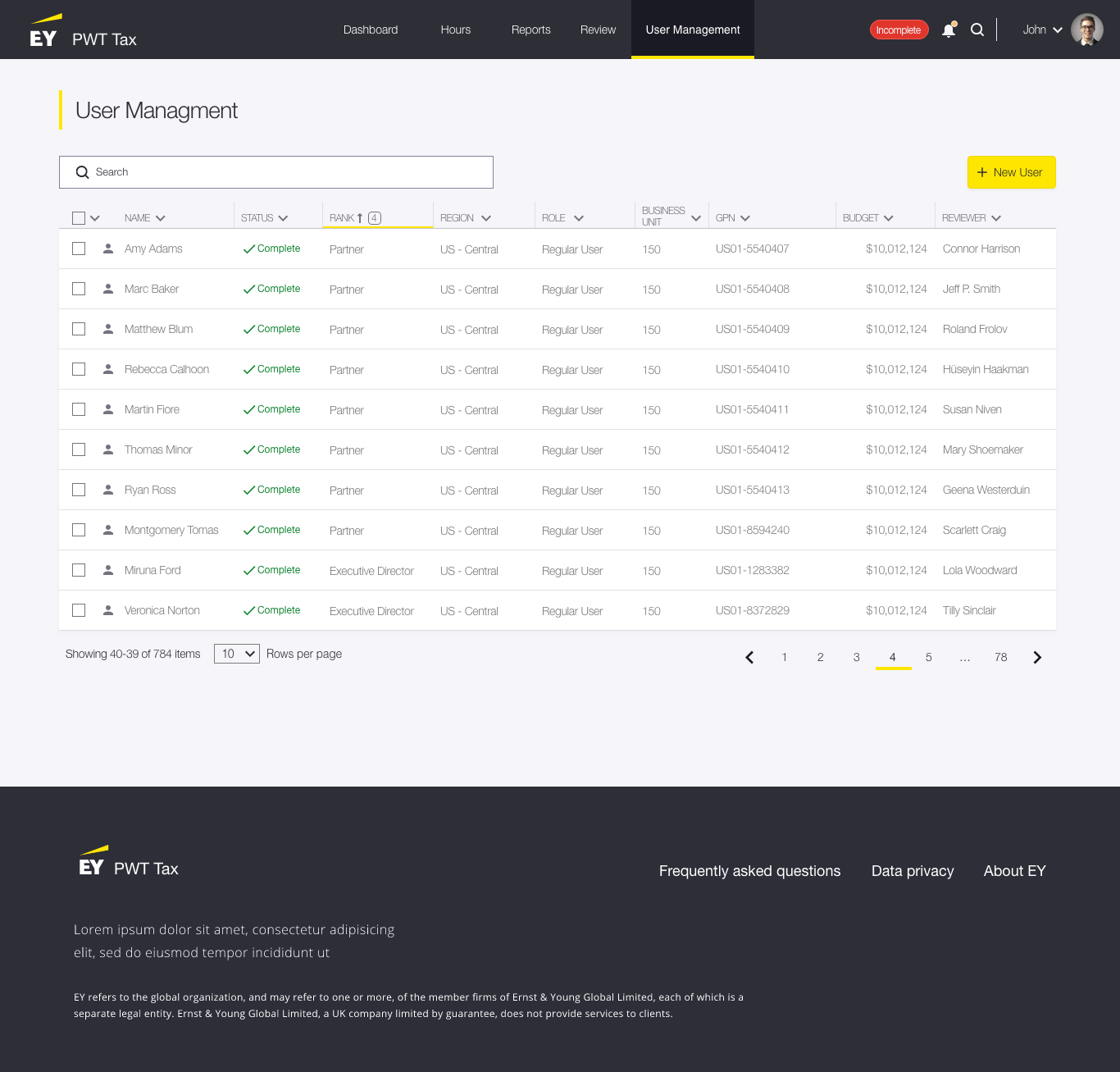
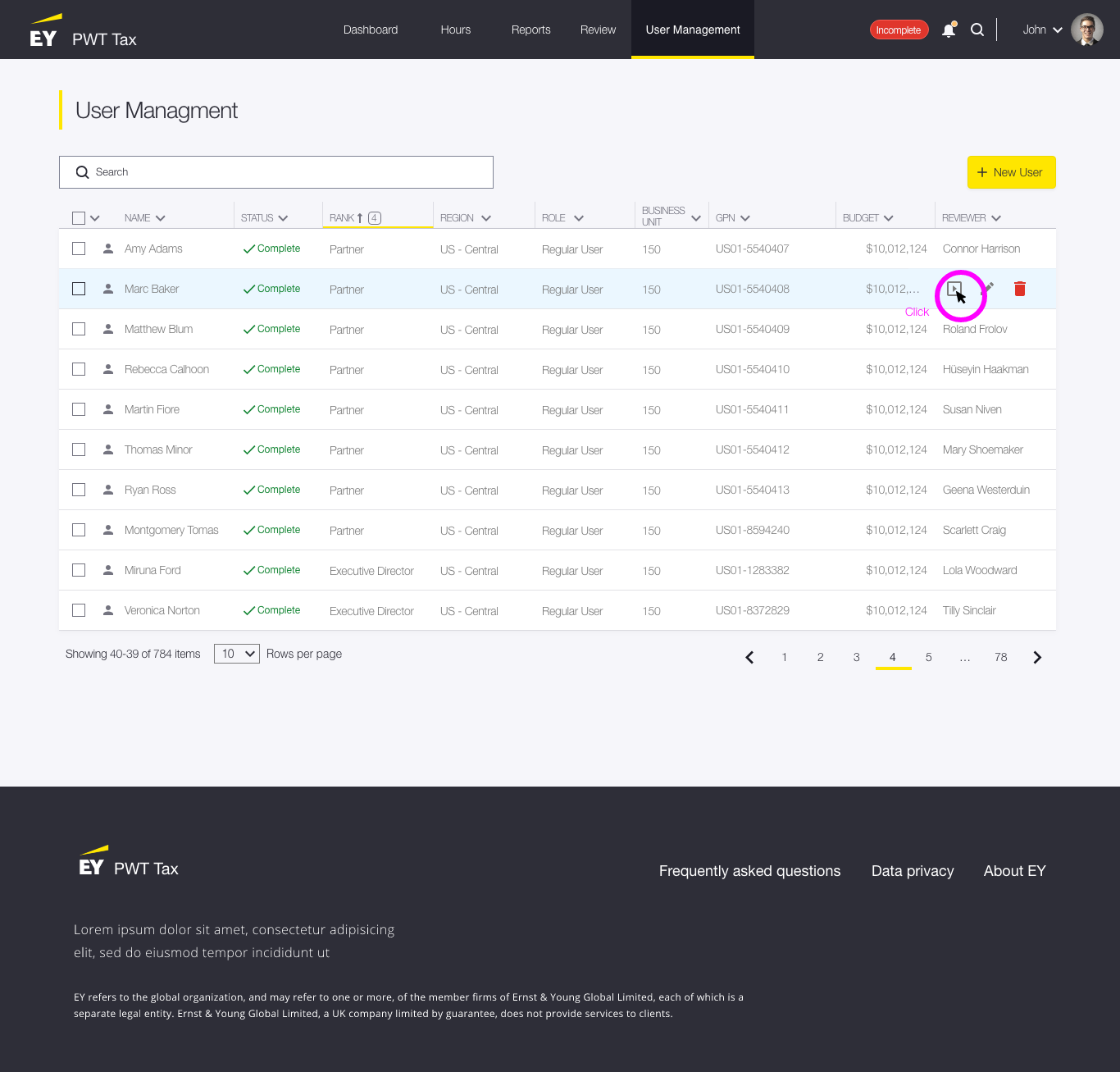
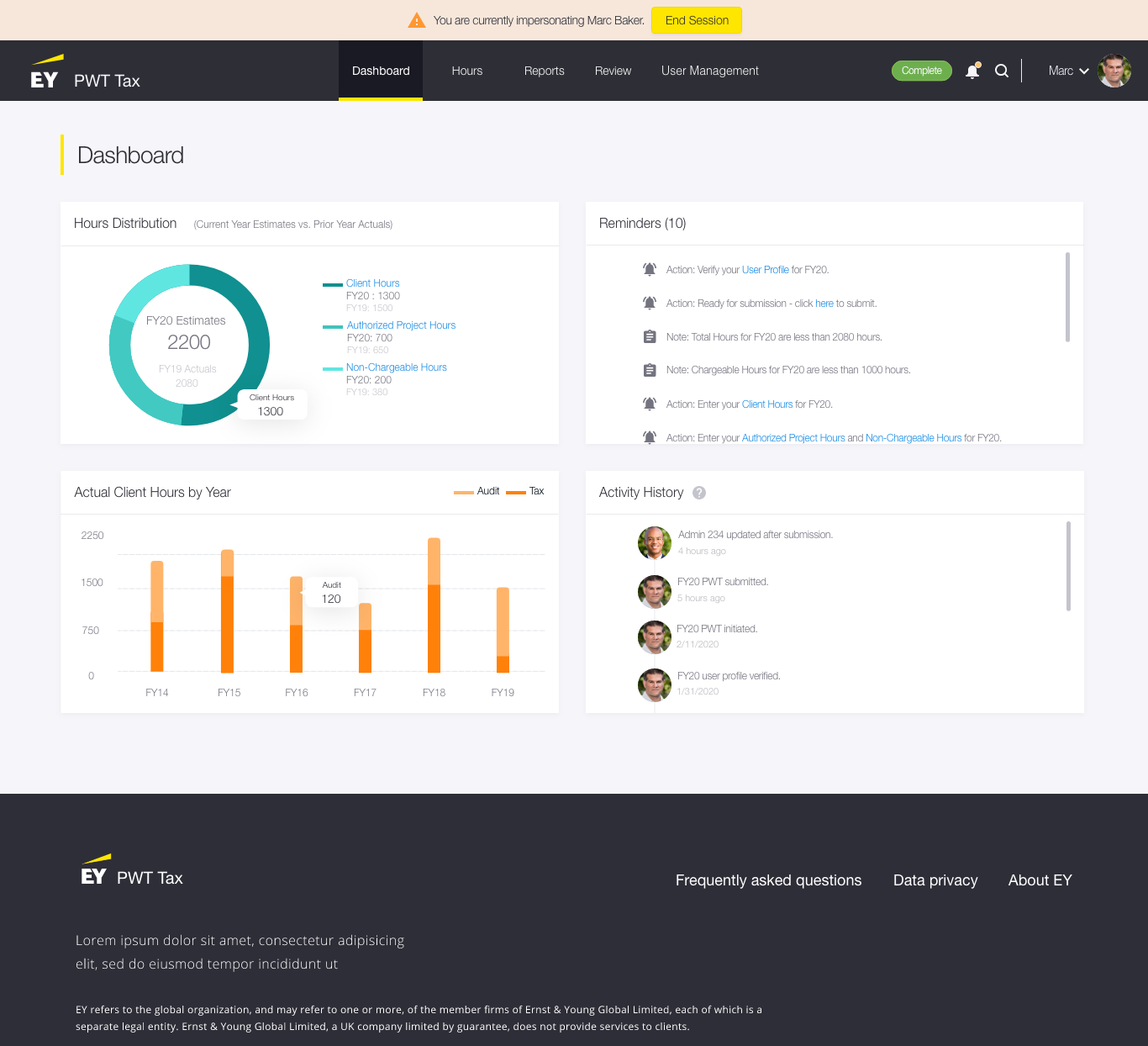
Our Sprint Zero Vision is not a blue sky, 10-year vision of a possible product but is instead a grounded, well-validated visual representation of what can be built and used today for Epic and Story creation, IP planning sessions and other product development events.
These sample pages were created for our Sprint Zero vision deck. Invision App was used for usability testing and also to present the work to stakeholders, which included the client, EY leadership and development teams. Over 30 people reviewed and provided feedback about the new layout. Feedback was overwhelmingly positive and many business leads asked when their product could have the same overhaul.
Dashboard
Final Thoughts
Although the product is still in flight, I fully anticipate that we will reach all of our goals. The preliminary test builds provided positive feedback about the product’s look and feel as well as ease of use. Users have been able to complete their tasks efficiently and a buzz around EY has already started. I hope to have a full report on its success very soon.


