INFORMATION ARCHITECTURE / USER EXPERIENCE / PRODUCT MANAGEMENT / USER INTERFACE
Equinix Customer Portal
Equinix is one of the world’s largest providers of colocation data centers and interconnection services. ~90% of global internet traffic passes through their network. Headquartered in Redwood City, the company operates 180+ data centers worldwide.
Background
My role on this project was to maintain Equinix’s customer portal. This portal or site allows Equinix’s customers to set up security, schedule maintenance on their cage, or order more equipment to an existing cage / rack. The portal generates over a billion dollars annually and has over 3,000 daily enterprise users. My first task was to evaluate the site and investigate the users' goals and pain points.
Discovery
When I first started, I realized the site needed a major overhaul of its UX and UI. The site was not consistent with font sizes, colors, spacing, grid systems, overlays, tooltips and other control usages and behaviors. The overall visualization would need to be addressed to create more consistency and legibility within the site.
PROTO PERSONAS
System Administrators
| Bio | Work onsite in the data centers |
|---|---|
| Behaviors | Heavy users - onsite users of the portal |
| Attitude | Choose functionality over design |
| Expertise | Advanced Level |
| Pain points: | UIs that are unnecessarily complicated |
| Goals: | Use automated task buttons and templates |
System Coordinators
| Bio | Schedule and create orders for the Sys Admins |
|---|---|
| Behaviors | Heavy Users - always on the portal |
| Attitude | Open to change as long as it results in faster task completion |
| Expertise | Advanced Level |
| Pain points: | Lack of automated task and templates and limited information about activity on-site and on the portal |
| Goals: | Keep everything running on schedule and provide information to the on-site sys admins |
Help Desk Operators
| Bio | Internal Equinix team that answers all support calls |
|---|---|
| Behaviors | Heavy Users - always on the portal |
| Attitude | Open to change if it makes the task easier or cuts the number of phone calls |
| Expertise | Experts on the portal and everything related to Equinix |
| Pain points: | Lack of automated tasks and no IM for ease of communication |
| Goals: | More admin controls |
The 80 percent
| Bio | System administrators that are located in 1 or 2 data centers |
|---|---|
| Behaviors | Light Users - login a few times a year |
| Attitude | Not familiar with how Equinix and its portal works |
| Expertise | Intermediate Level - may know the industry lingo, but need guidance with the portal. Step-by-step tutorials are helpful. |
| Pain points: | Lack of information about the function of the pages |
| Goals: | Understand the process and finish a task in a reasonable amount of time |
Design Goals
• Updated visualization to increase legibility
• Consistent font sizes, colors, spacing, grid systems
• Consistent overlays and tooltips
• Consistent control usage
• Consistent behavior
• Simplified organization and navigation
• Flexible environment for translation into 7 different languages
Scope
This redesign involved every page, overlay, tooltip, icon, and UI control. Close to 200 different scenarios needed wireframes and mockups.
Information Architecture
The goal was to simplify the organization and visualization of the breadth of ECP user tasks.
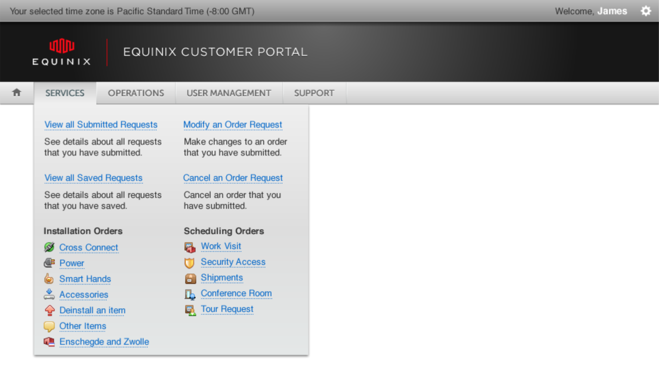
On a more visual front, Mega-Dropdown menus were added to support differing levels of information density. This allowed for simple visual prioritization of tasks, helping users understand EQIX terminology as well as the differences between similarly-named menu items.
On a more visual front, Mega-Dropdown menus were added to support differing levels of information density. This allowed for simple visual prioritization of tasks, helping users understand EQIX terminology as well as the differences between similarly-named menu items.
Design System
The design system was created quite by necessity. As I was the only person working on the product I needed to dissect all of the pages of the site into modules and create a Style guide around it. Some elements of the old site needed to be removed and other elements needed to be added.
In order for a design system to succeed, new features need to accommodate the existing UI structure and modules.
The design style is very compact because the times and framework of the system limit page real-estate. The elements themselves were designed by Equinix


Wireframes
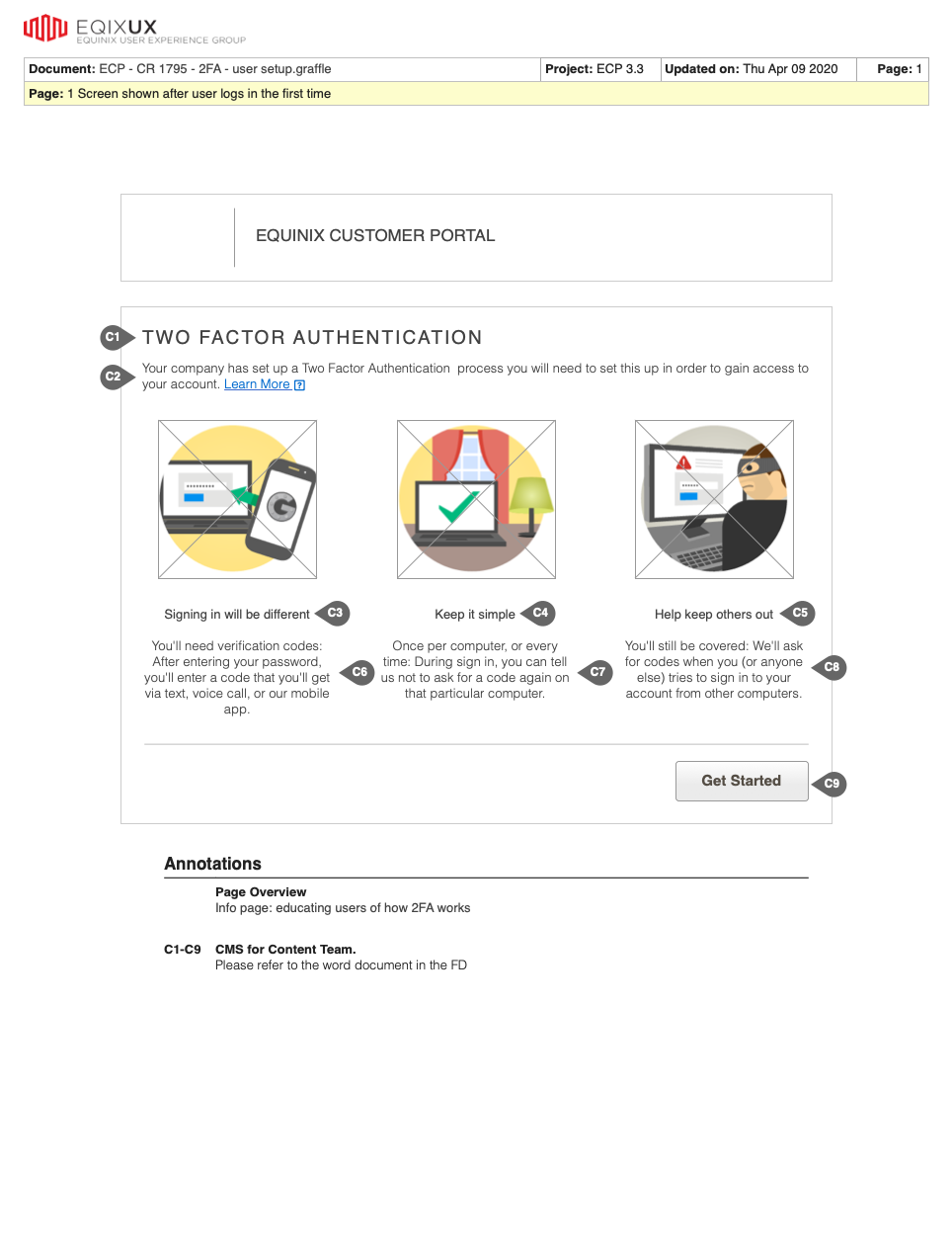
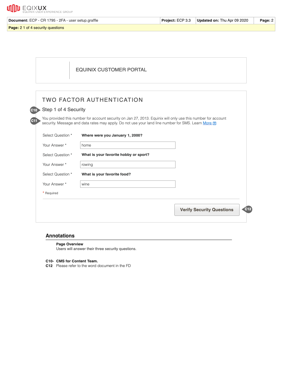
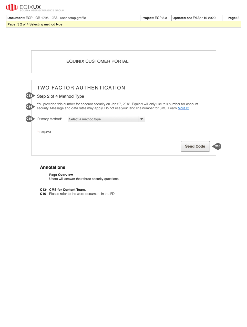
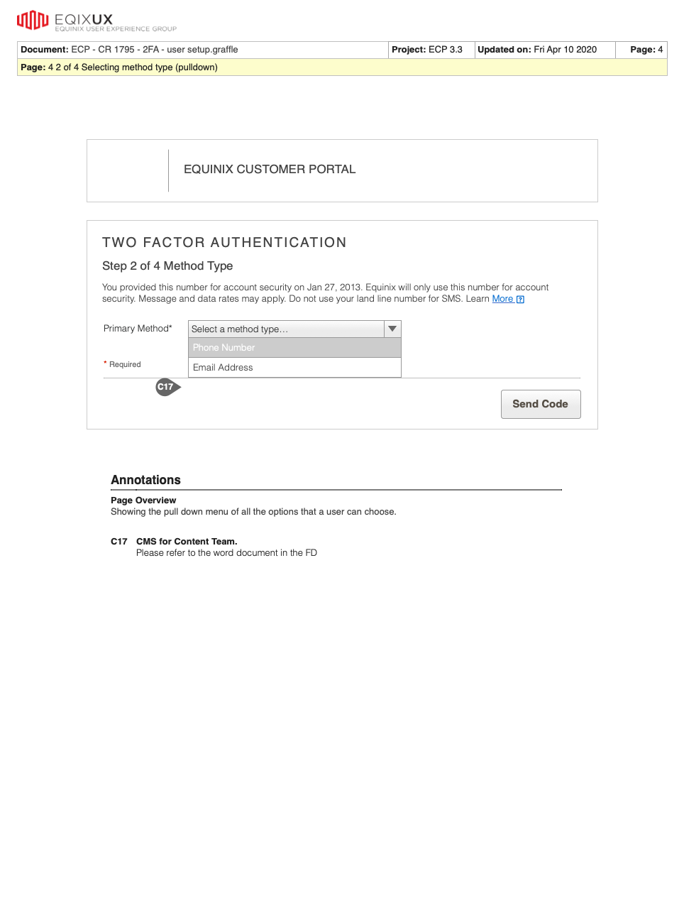
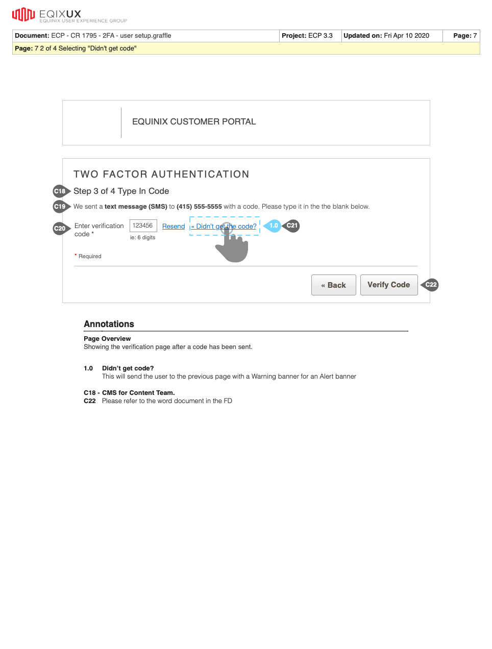
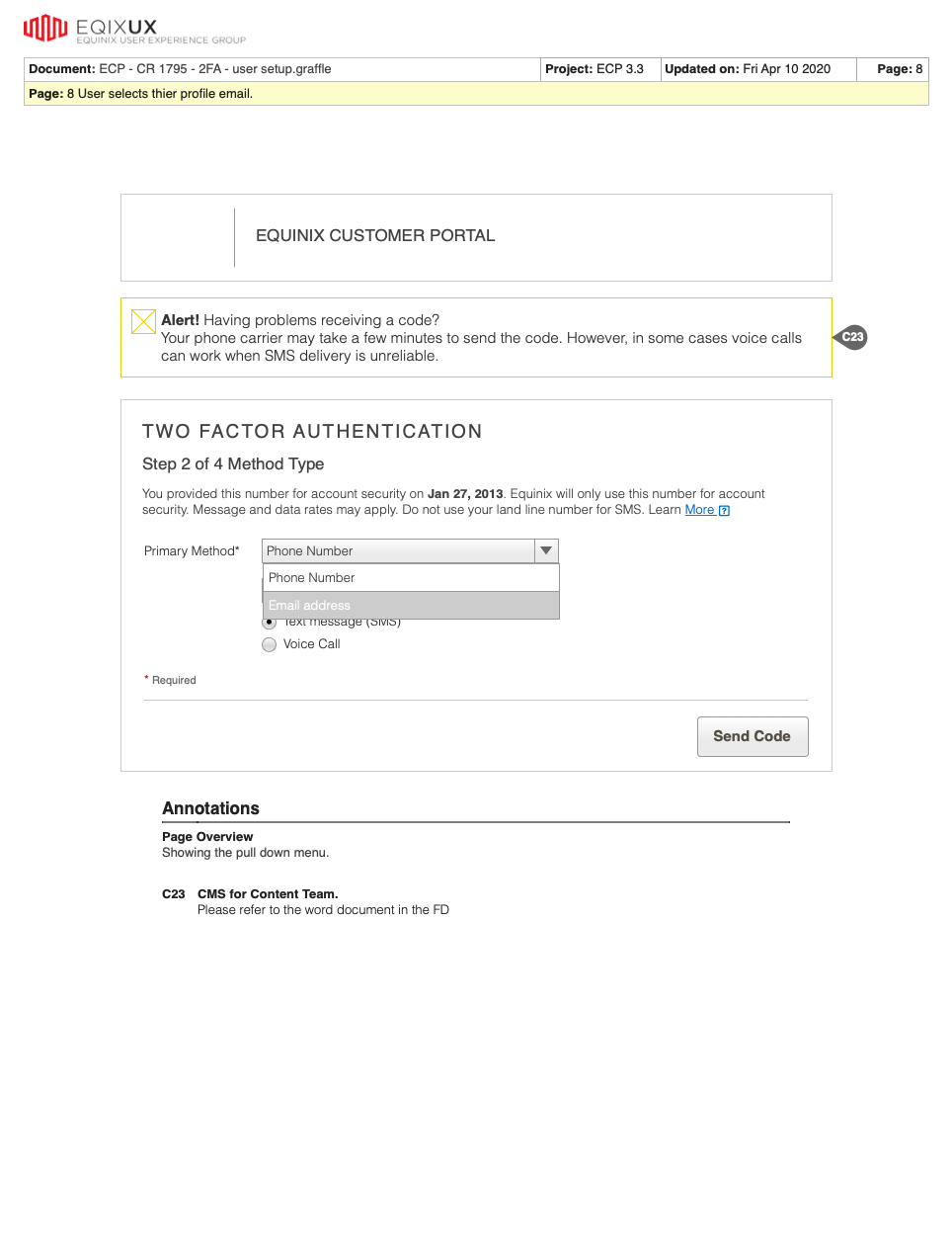
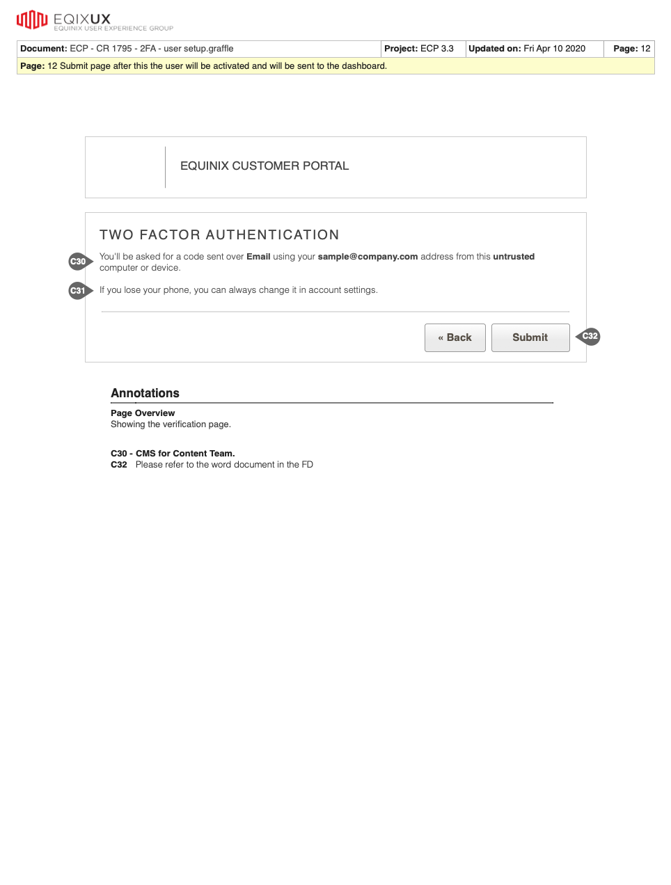
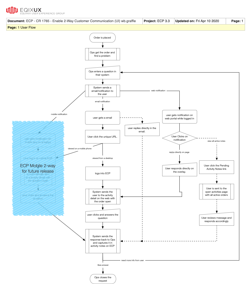
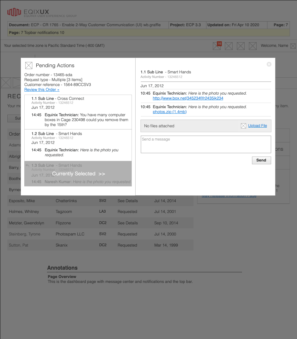
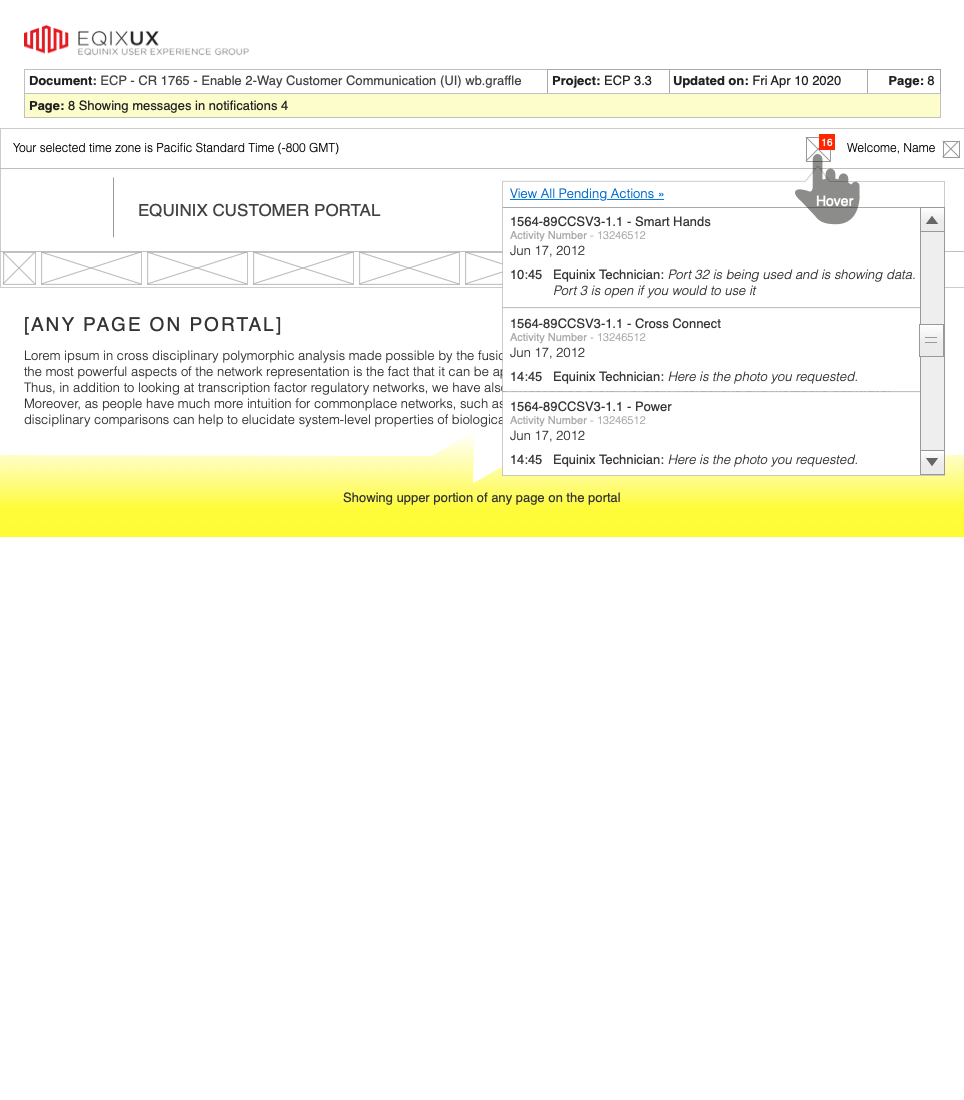
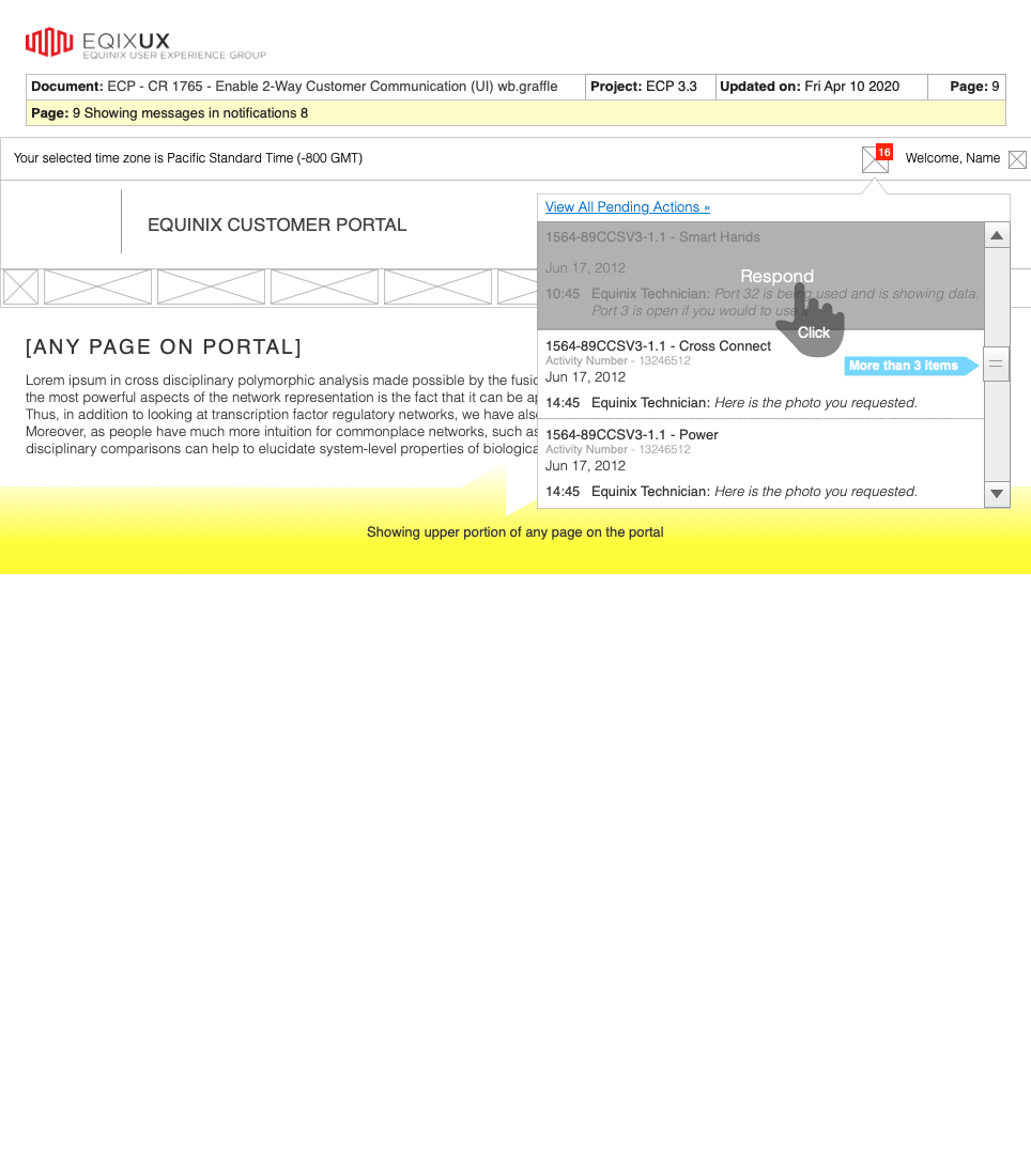
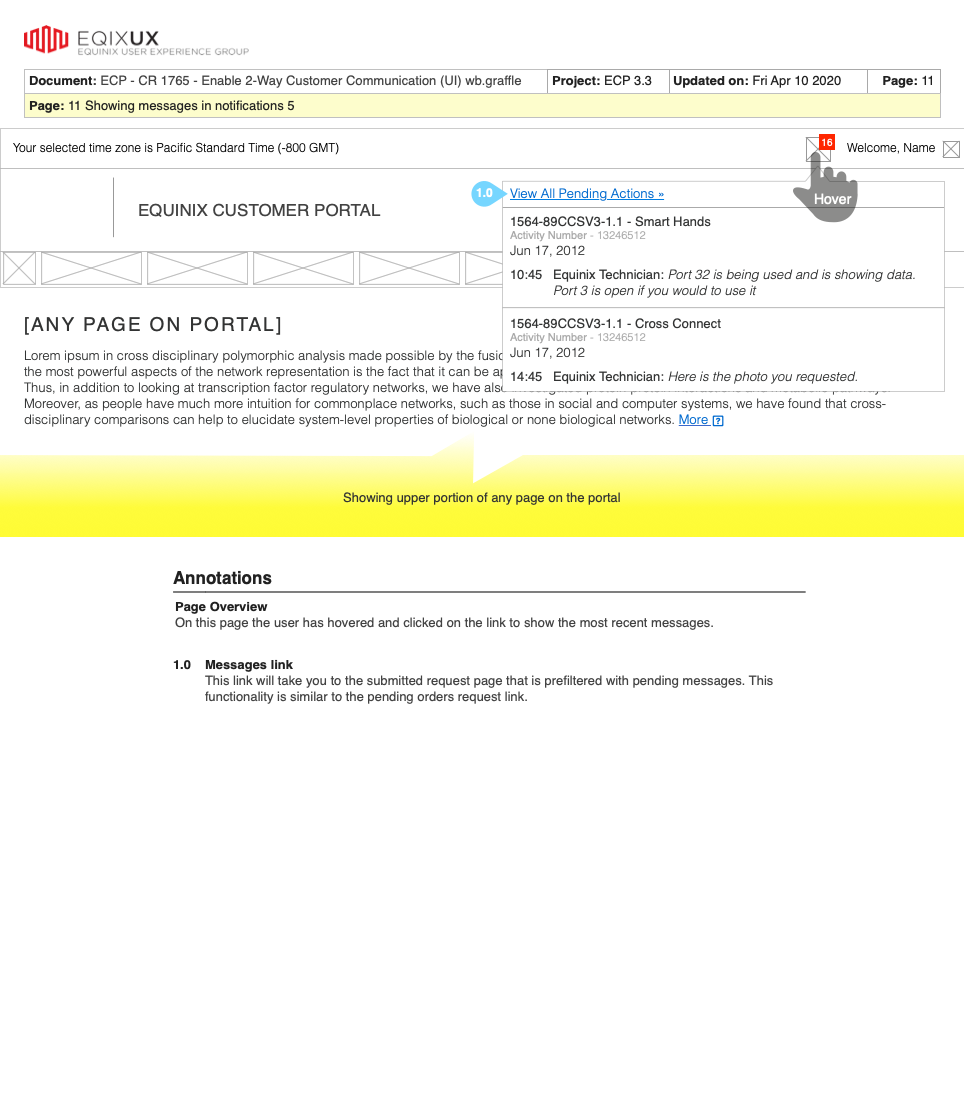
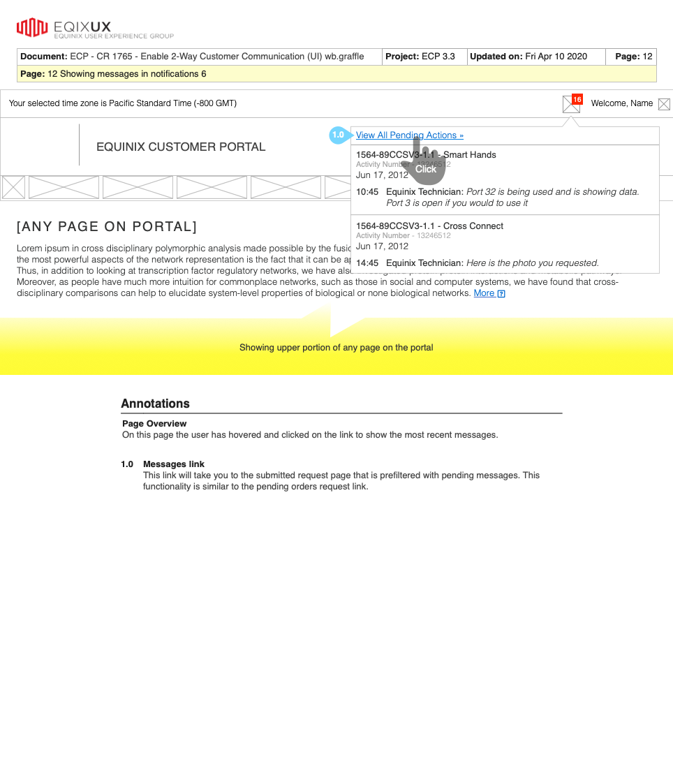
Wireframes are usually an essential tool in the UX briefcase. However, this site's redesign was created with very few. The following is one example.
Mockups
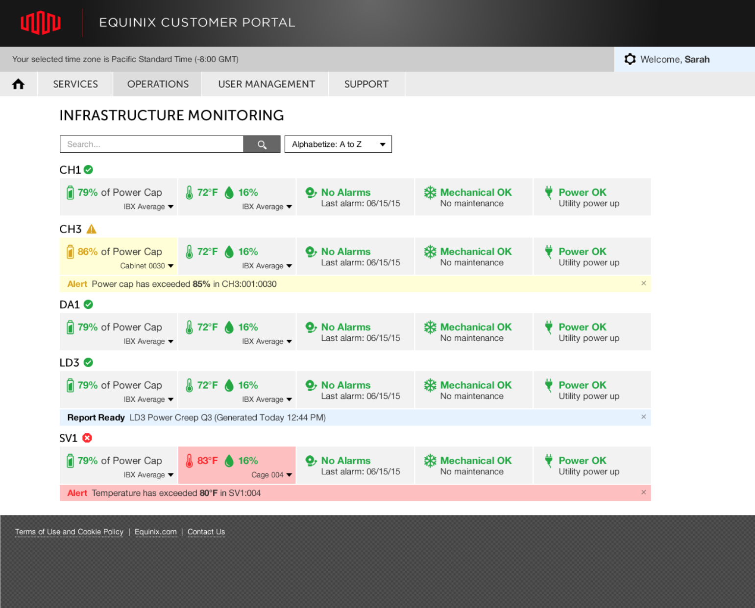
Mockups were the tools of choice for this site. The design system enabled the mockups to be created more quickly than traditional wireframes because the elements were already established. This allowed me to deliver high-level pixel-perfect mockups, leaving little room for interpretation for the product and development teams, and resulting in a higher level of expectation for everyone involved.
Results
The results were an immediate success. All design goals were met. Font sizes, colors, spacing, grid systems, overlays, tooltips and other control usages and behaviors were all consistent from page to page. Time spent on pages decreased and calls to the help desk decreased. Operations time on the portal increased due to the new data grid layout. Users spent less time searching for their orders and navigating complicated pages on the portal.

