USER EXPERIENCE / USER INTERFACE
Mobile ECP
Equinix is one of the world’s largest providers of colocation data centers and interconnection services. ~90% of global internet traffic passes through their network. Headquartered in Redwood City, the company operates 180+ data centers worldwide.
Background
This mobile application is a subset of a larger product. It is impractical to create a mobile app using the entire platform. During the discovery phase of the user research, we captured user sentiment and opinions on primary tasks, including pain points related to those tasks on the main platform. Would these tasks be useful in a mobile format? When might a user use the app to perform these tasks, as opposed to a desktop or laptop? That research resulted in four areas being added to a mobile platform rather than to the entire product.
This deck consists of user flows, a style guide, wireframes, mockups, and a clickable prototype.
User Flows
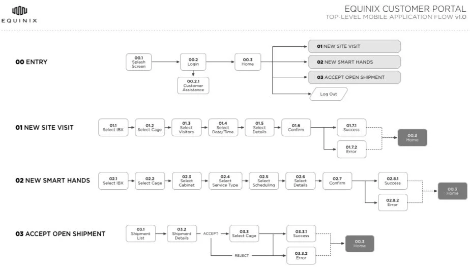
TOP LEVEL APPLICATION FLOW
Top level user flow of the three primary products used in the application.
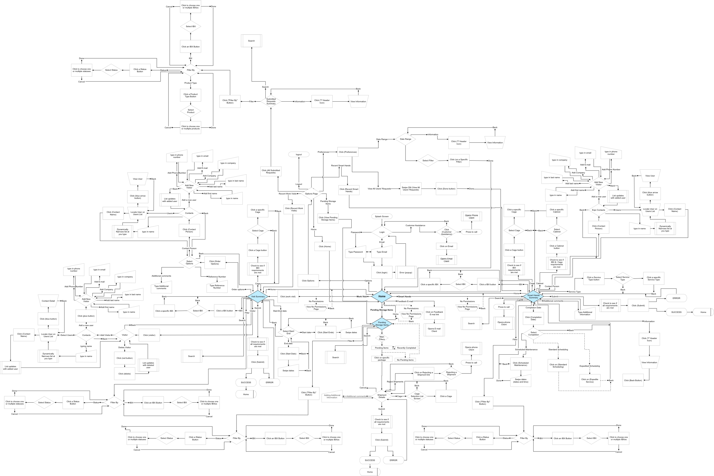
USER FLOW
Users
DESIGNING FOR UTILITY USERS
This application is utilitarian for the end users. It is not the preferred software if a desktop is available, but rather a useful module when away from one's desk. It allows one to act on urgent matters and provides notifications about lower priority items that can be addressed once back at the desk.
System administrators
| Bio | Work onsite in the data centers |
|---|---|
| Behaviors | Heavy users - onsite users of the portal; may not have access to a desktop |
| Attitude | Choose functionality over design |
| Expertise | Advanced Level |
| Pain points: | UIs that are unnecessarily complicated |
| Goals: | Use automated task buttons and templates |
System coordinators
| Bio | Schedule and create orders for the Sys Admins |
|---|---|
| Behaviors | Light Users - may be away from their desk and in need of the mobile vertion |
| Attitude | Open to change as long as it results in faster task completion |
| Expertise | Advanced Level |
| Pain points: | Lack of automated task or templates and limited information about activity on-site and on the portal |
| Goals: | Keep everything running on schedule and provide information to the onsite sys admins |
Style Guide
Keeping in mind that users of the portal are very task-oriented, functionality and performance were prioritized over style. Outside of some small custom UI elements, everything else followed the operating systems material and functional guidelines. The application was similar to the established operating system so that users expectations and muscle memories remained intact. This made the users feel very comfortable.
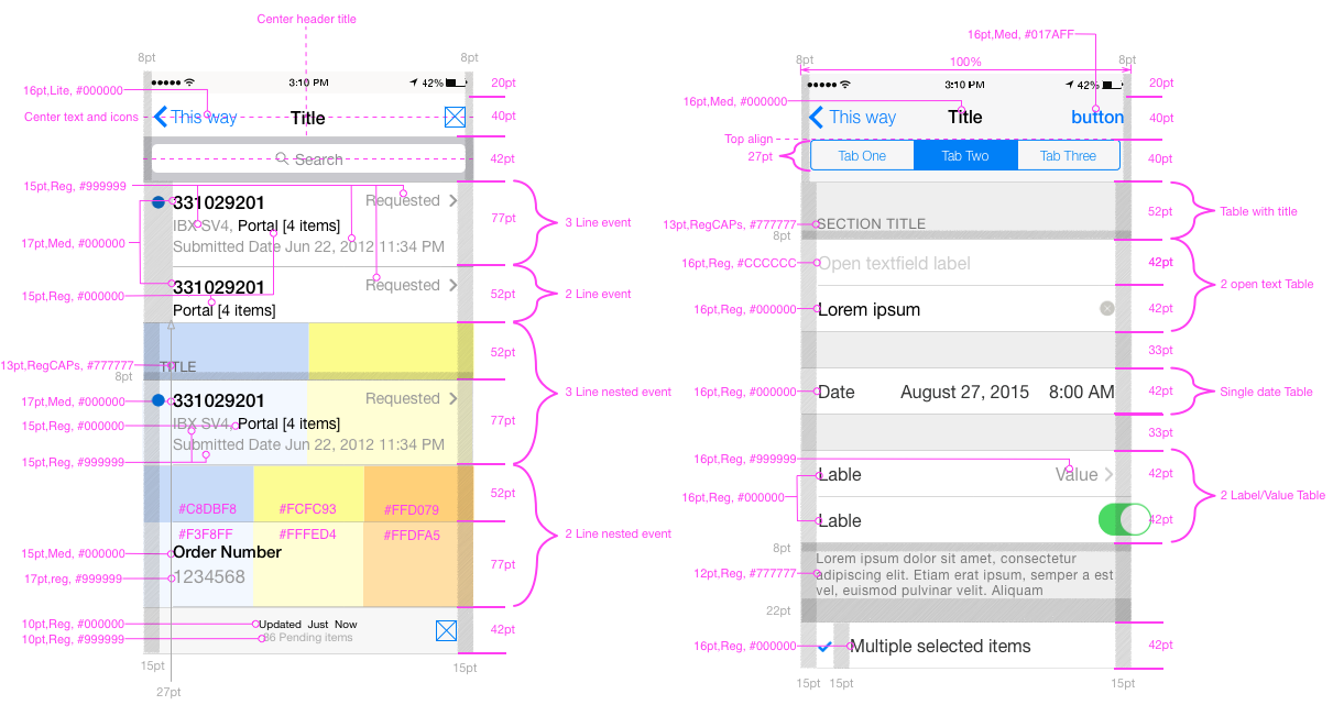
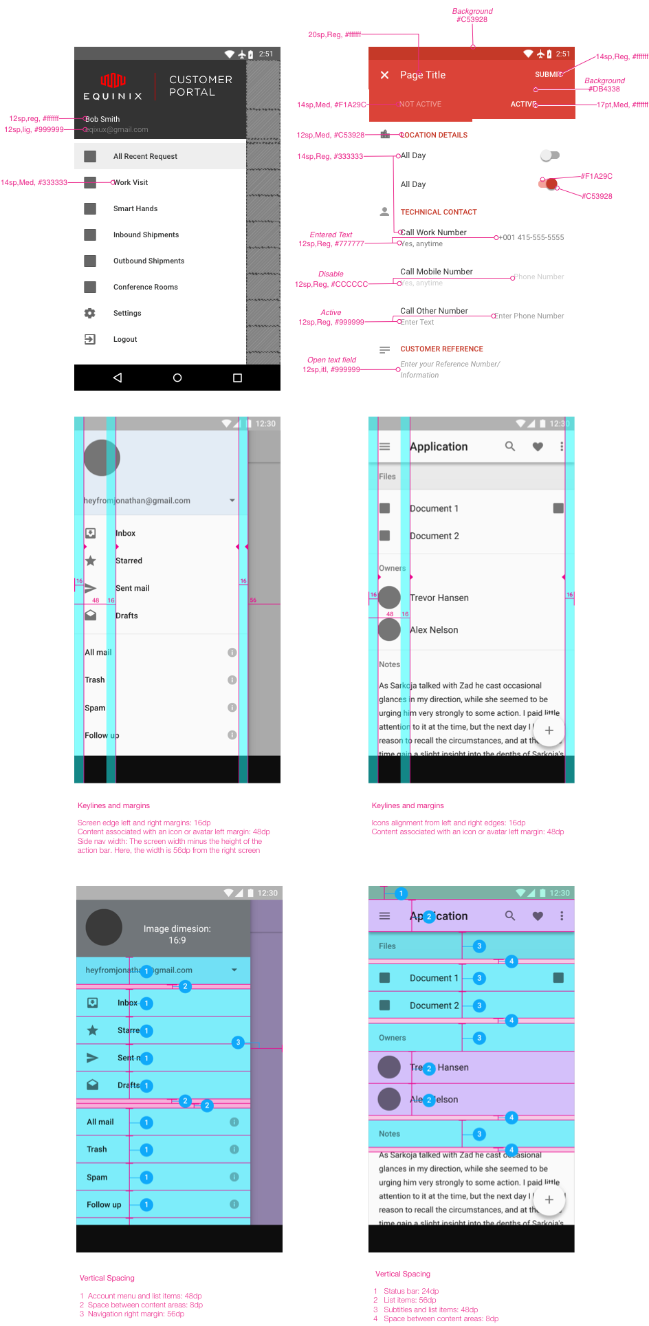
ONE PAGE STYLE GUIDE
A one-page style guide was created for the overseas development team. I would often create a more in-depth study guide but later found it to be counterproductive as the iteration cycle was so quick. I spent more time updating the in-depth style guide than doing actual work. The overseas teams were quite competent and only needed information about the color, font sizes and spacing. Therefore, I created a one-sheet style guide that could easily be printed or put up on the screen. This way, the developers did not need to flip through multiple pages – the one-pager could provide all the information they needed at a glance.
iOS
Android
Mockup and Wireframe Samples
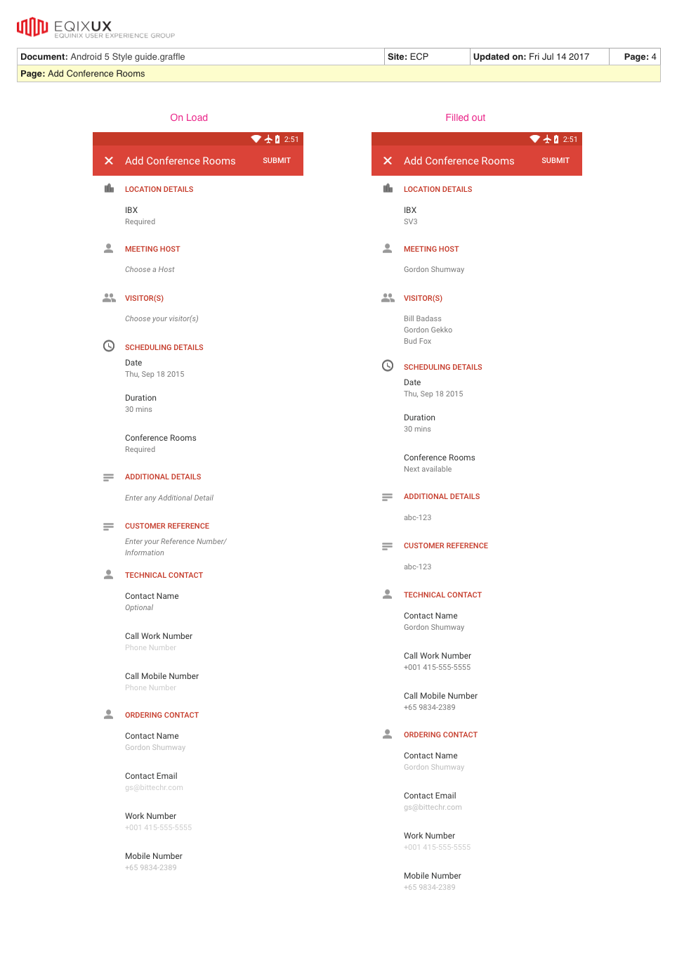
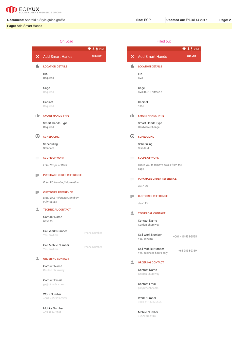
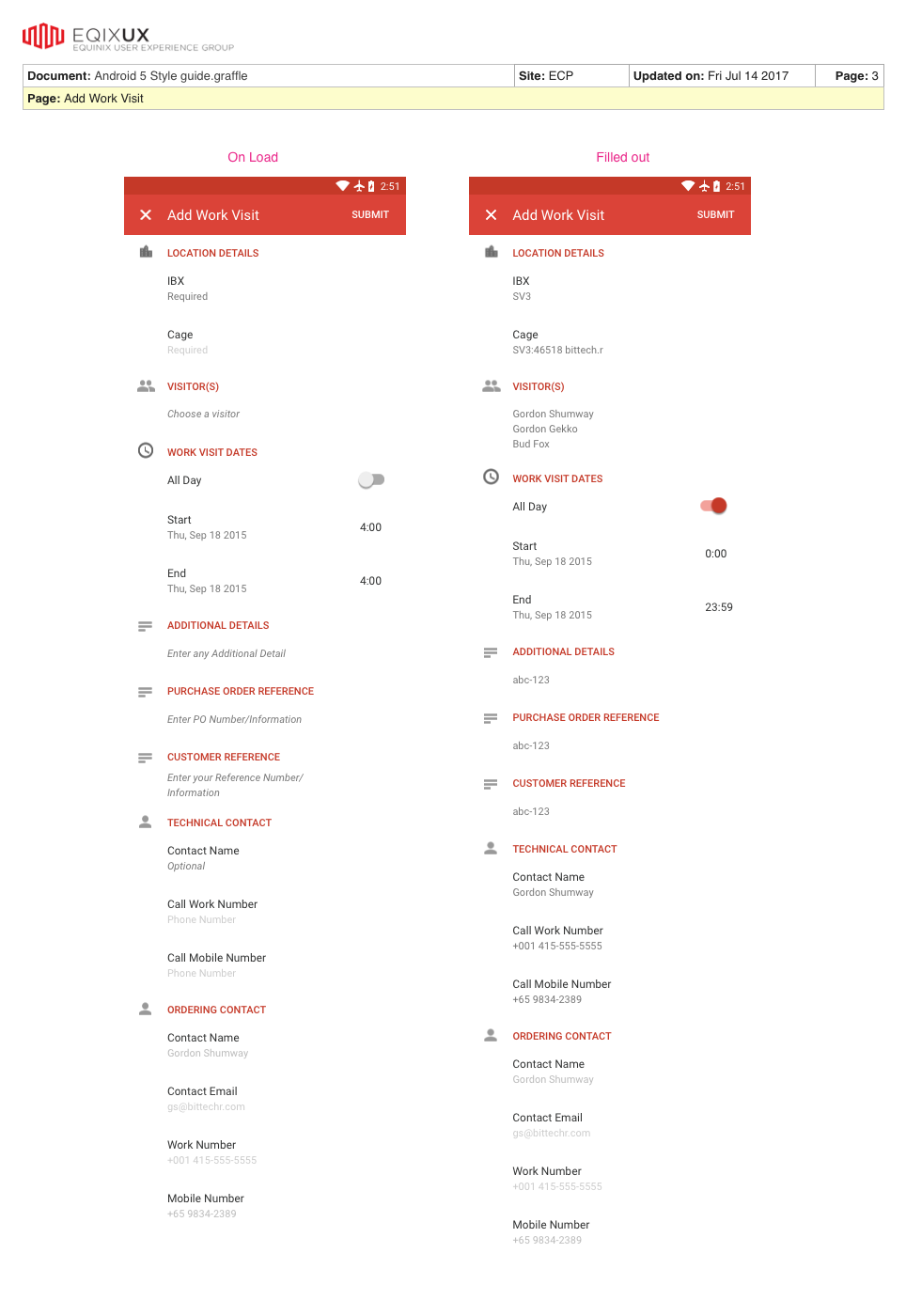
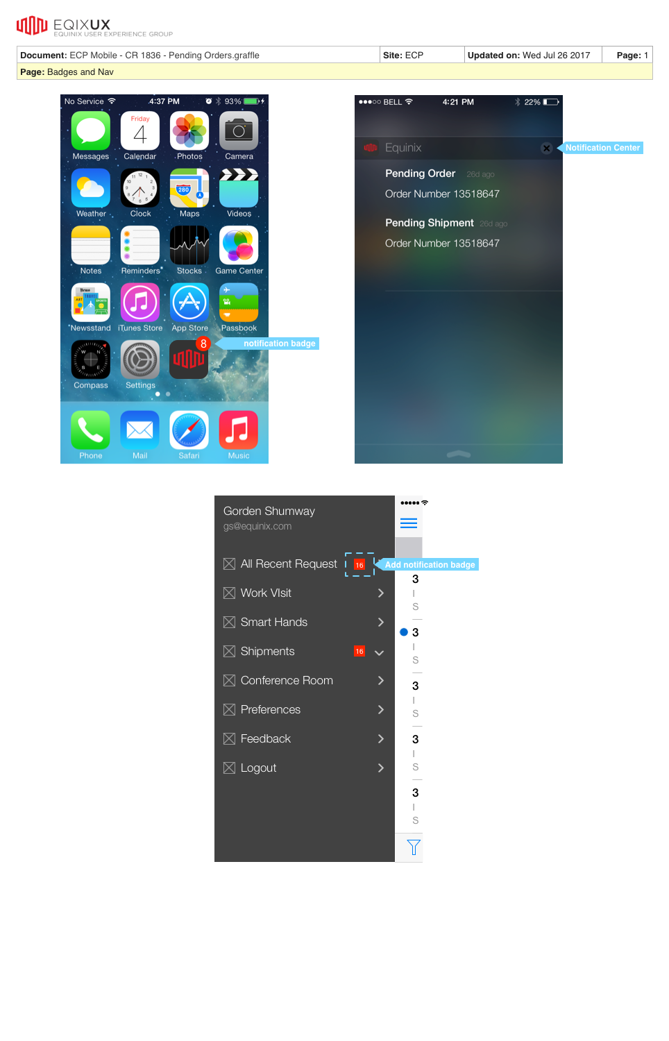
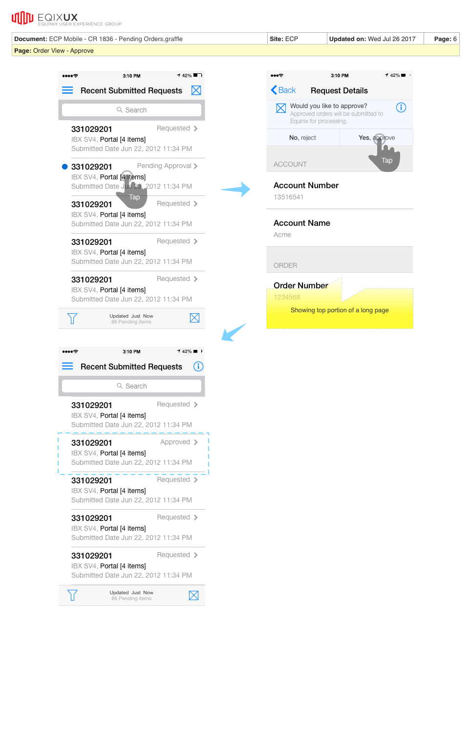
These deliverables were added as support material for product development stories and epics.
ANDROID MOCKUPS
IOS WIREFRAMES
Clickable Prototype
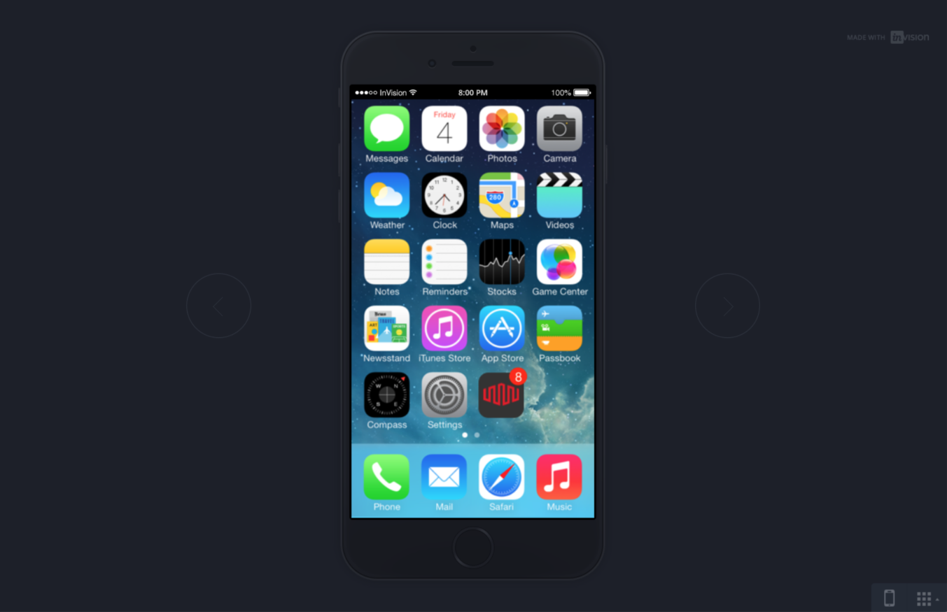
This clickable prototype is linked to Invision app. Click Here to begin.

