INFORMATION ARCHITECTURE / USER EXPERIENCE
Equinix Data Center Portal
Equinix is one of the world’s largest providers of colocation data centers and interconnection services. ~90% of global internet traffic passes through their network. Headquartered in Redwood City, the company operates 180+ data centers worldwide.
Background
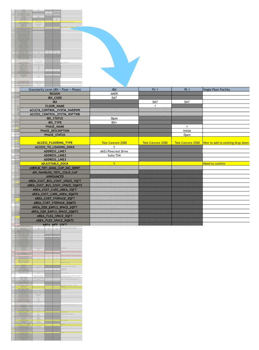
This site was an internal portal used by the sales and infrastructure teams at Equinix. When first presented to me, the project only consisted of a site of spreadsheet links. The spreadsheets consisted of hundreds of different attributes of all of the data centers in Equinix's empire and the backend system hat stored them. I was tasked with creating a portal from these spreadsheets that would allow the infrastructure teams the ability to update the data and would make it presentable for sales team use when selling infrastructure space and network services.
Discovery
What were these spreadsheets and how were the infrastructure teams and sales teams using them?
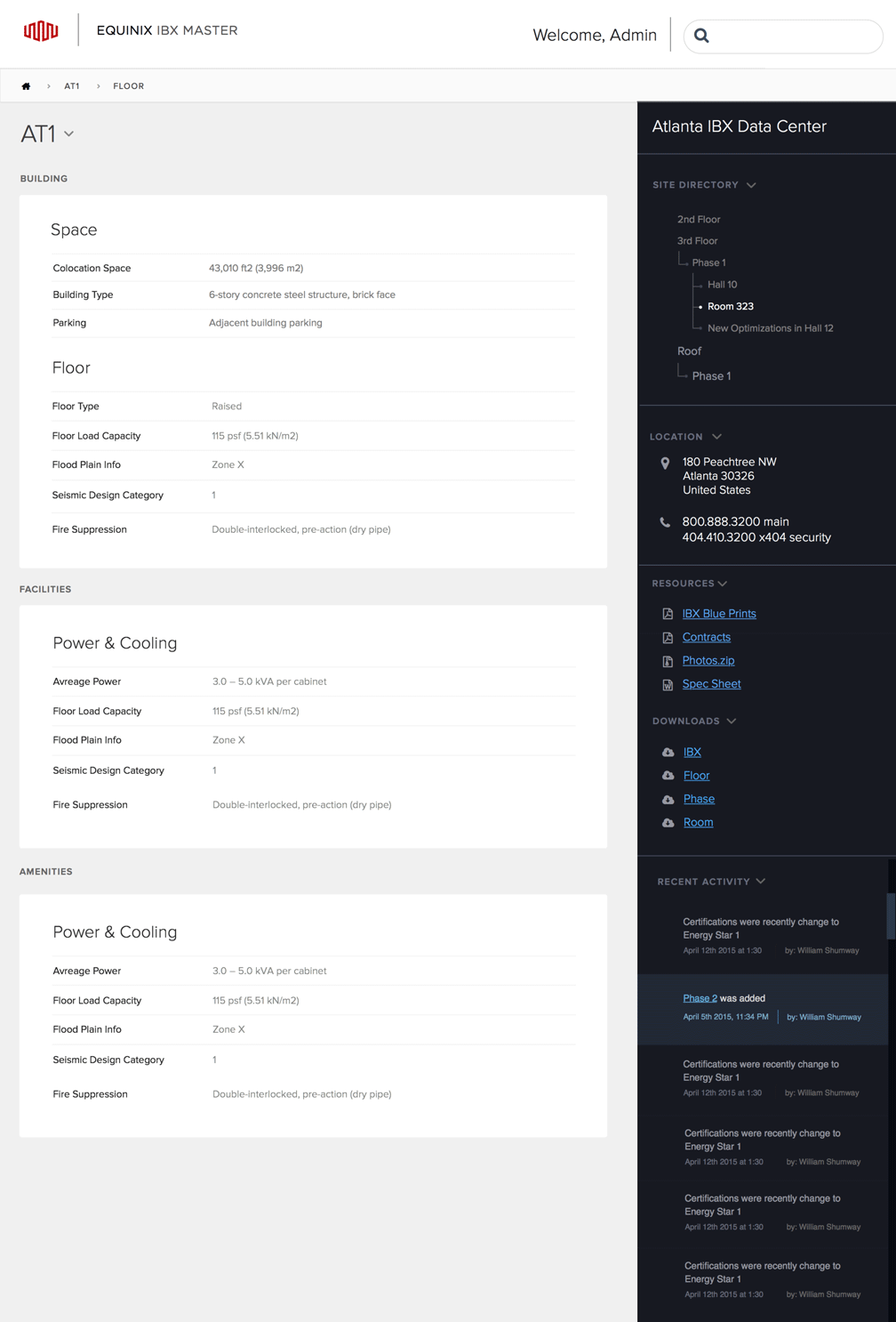
The spreadsheets consisted of detailed information about the data centers: the layout, size of the rooms, type of power at the facility, type and power of the cooling system, etc. This consisted of approximately 400 attributes. Within these attributes, there were four levels of granularity: the data center, floor, phase, and room levels. Certain attributes were applicable to some of these levels and others were applicable to all. The infrastructure team’s goal was to create a site to house all of this information with the ability to update it as needed. However, the sales team was only interested in a handful of attributes so it was necessary to find a way to hide the extraneous information.
PRODUCT DESIGN GOALS
Move all of the data from Excel sheets to the actual website
Export data in a friendly to look at PDF
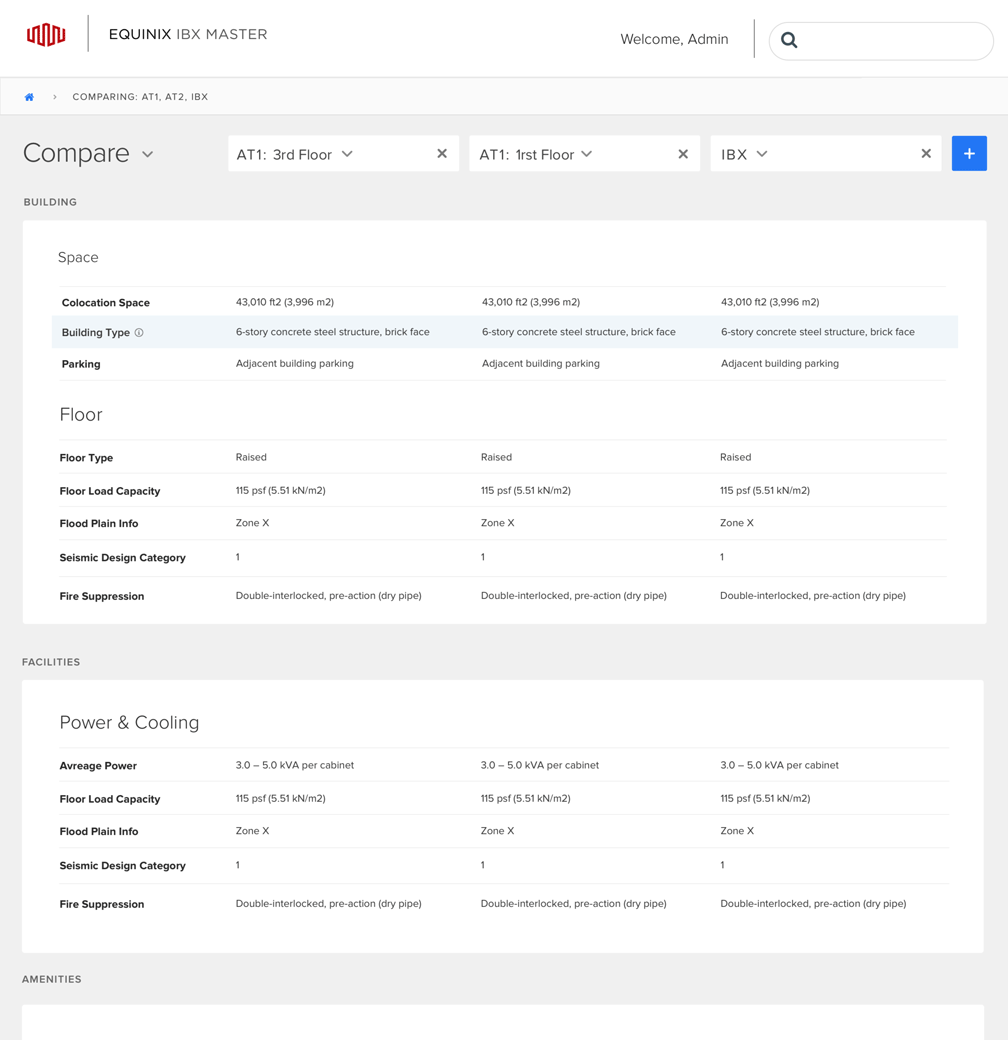
Add functionality to quickly edit data globally
Pare down data for ease of comprehension
Add an option to generate reports
Create ability to add new data centers to the site
PROTO PERSONAS
Infrastructure Team
| Bio | Builds data centers |
|---|---|
| Behaviors | Light users - in and out |
| Attitude | Choose functionality over design |
| Expertise | Advanced Level |
| Pain points: | No easy way to access all the available information or to compare that data |
| Goals: | Get into the site, make quick corrections, access various attributes, add assets, and compare data centers down to the cage level. |
Sales Team
| Bio | Sells space and products |
|---|---|
| Behaviors | Heavy Users - always on the site |
| Attitude | Interested in aesthetics and is simplicity of use |
| Expertise | Intermediate Level |
| Pain points: | No easy way to access and compare data or print it out in a nice format |
| Goals: | Export PDFs and send them to the client |
Task Analysis & Information Architecture
This site consisted of a group of pages with lists of attributes and permissions that allowed groups of users to hide, edit, add, and export attributes. As an internal site, most of the user roles within the company had already been set. This removed the need to create a permissions page, a feature necessary for most sites.
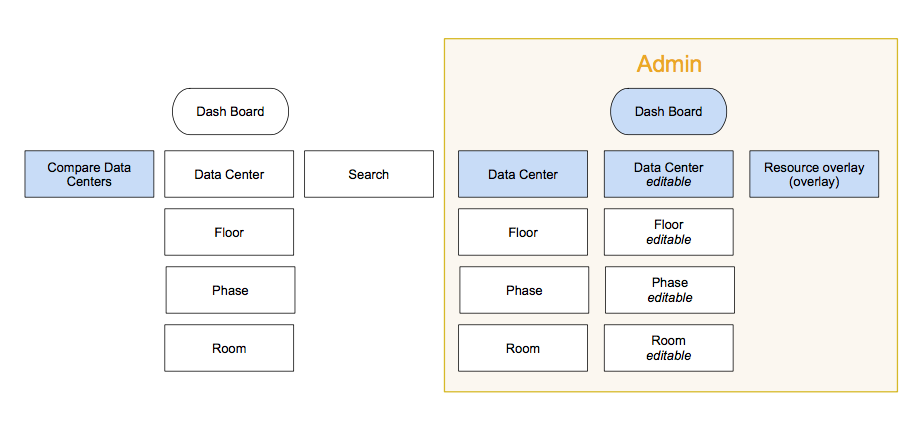
This is the site map for the admin and the regular users. As you can see, it is very simple. The items marked in blue will need a HTML page.
Another challenge was dealing with the large amount of attributes. First, I needed to learn the role of every attribute so as to allow me to categorize them into groups. Next, I needed to determine which attributes applied to which of the four hierarchy levels of the data center in order to establish the comprehensive group structure. A further challenge was to elucidate whether attributes at the UI level needed input text fields, radio buttons, or checkmarks. This step involved many conversations with stakeholders to ensure that everyone was on the same page. The stakeholders also had input about what the sales teams were allowed to see. Much of the information on the site is extremely confidential and even the sales teams are not privileged to it..
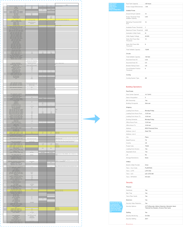
A brief look at the transition from the spreadsheet to page layout
User Flow
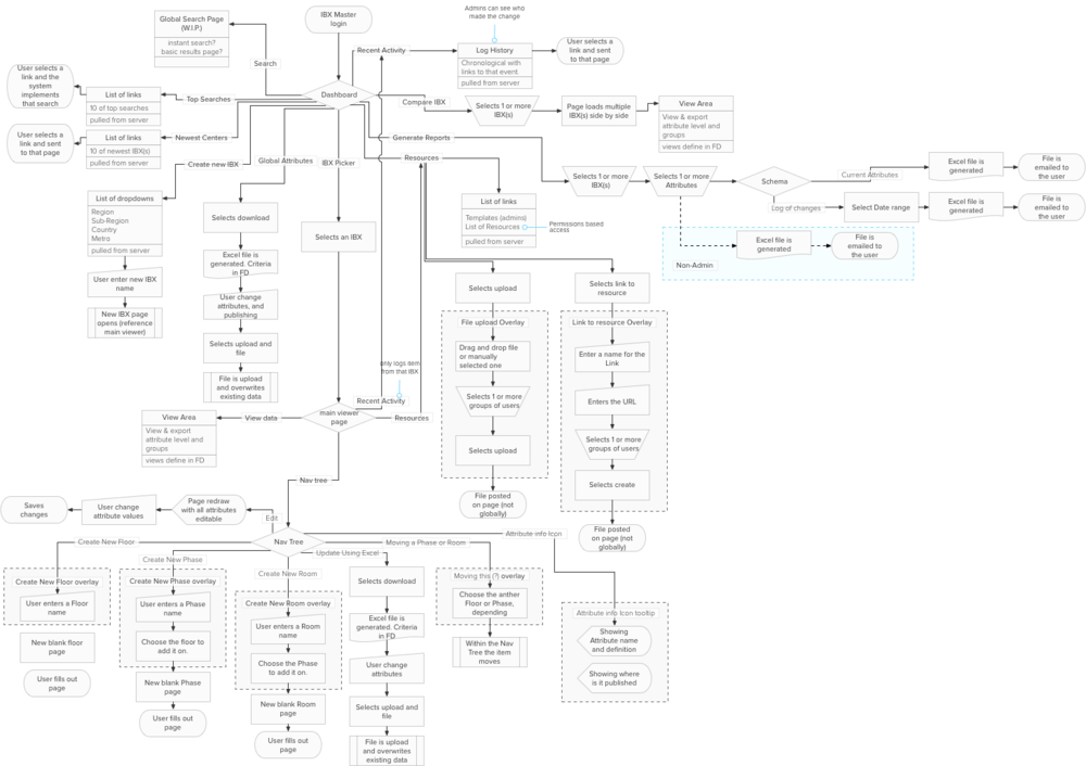
This is the user flow for the site. Most interactions for the site exist on two pages.
Usability
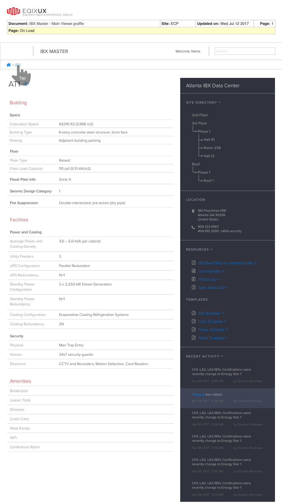
The top navigation bar for the site was quite simple. So simple, in fact, that no navigation at the top level was needed. The ability to start the process at the dashboard level removed clutter and simplified the interface. A bread crumb at the IBX level as well as a persistent home button and search button were the only necessities.
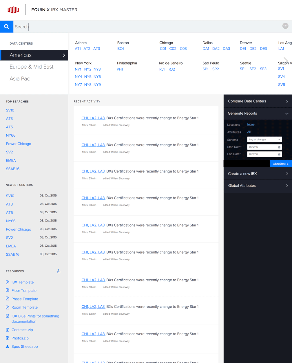
Home page or dashboard-focused approach as opposed to a Top Navigation approach.
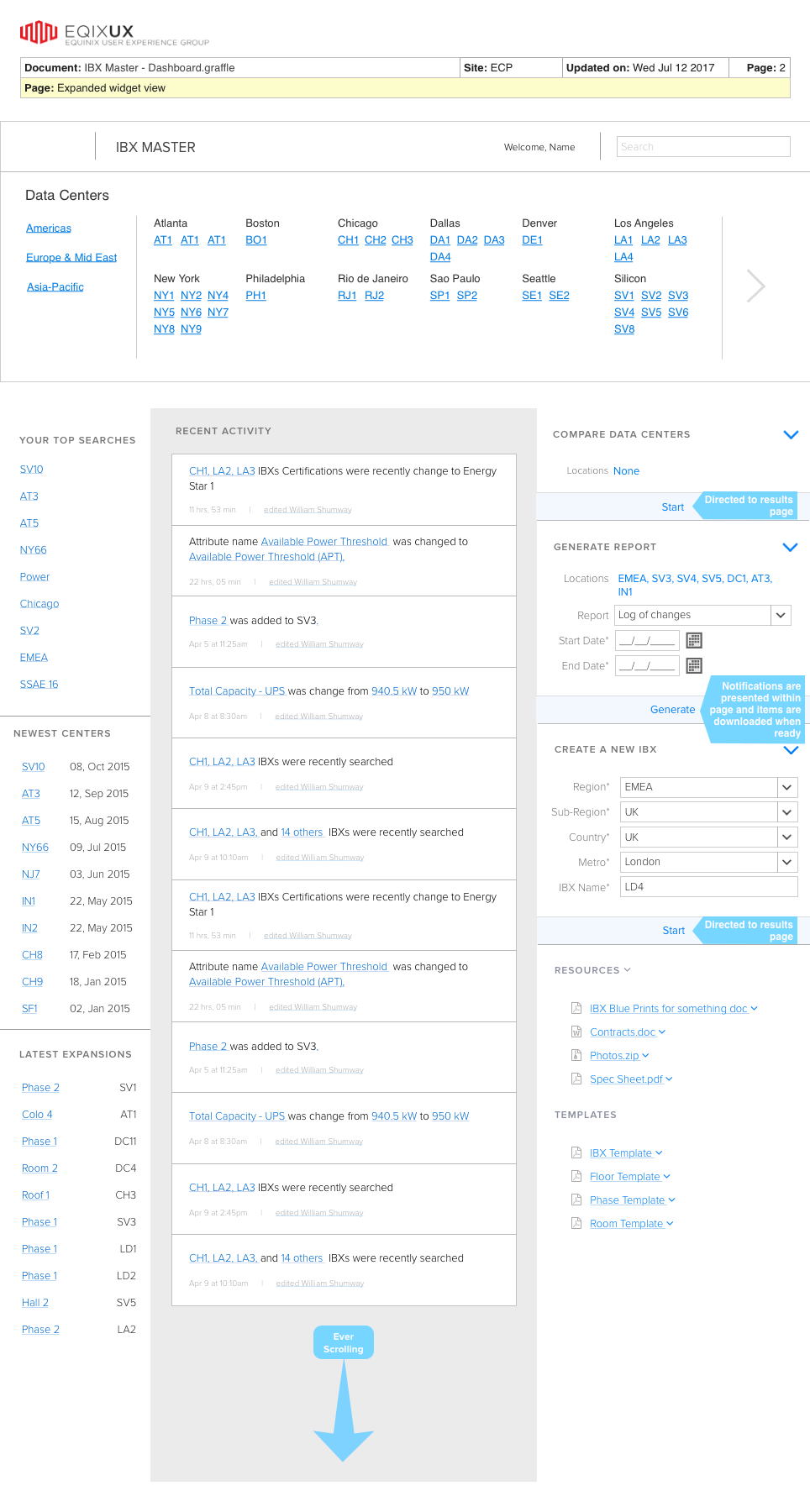
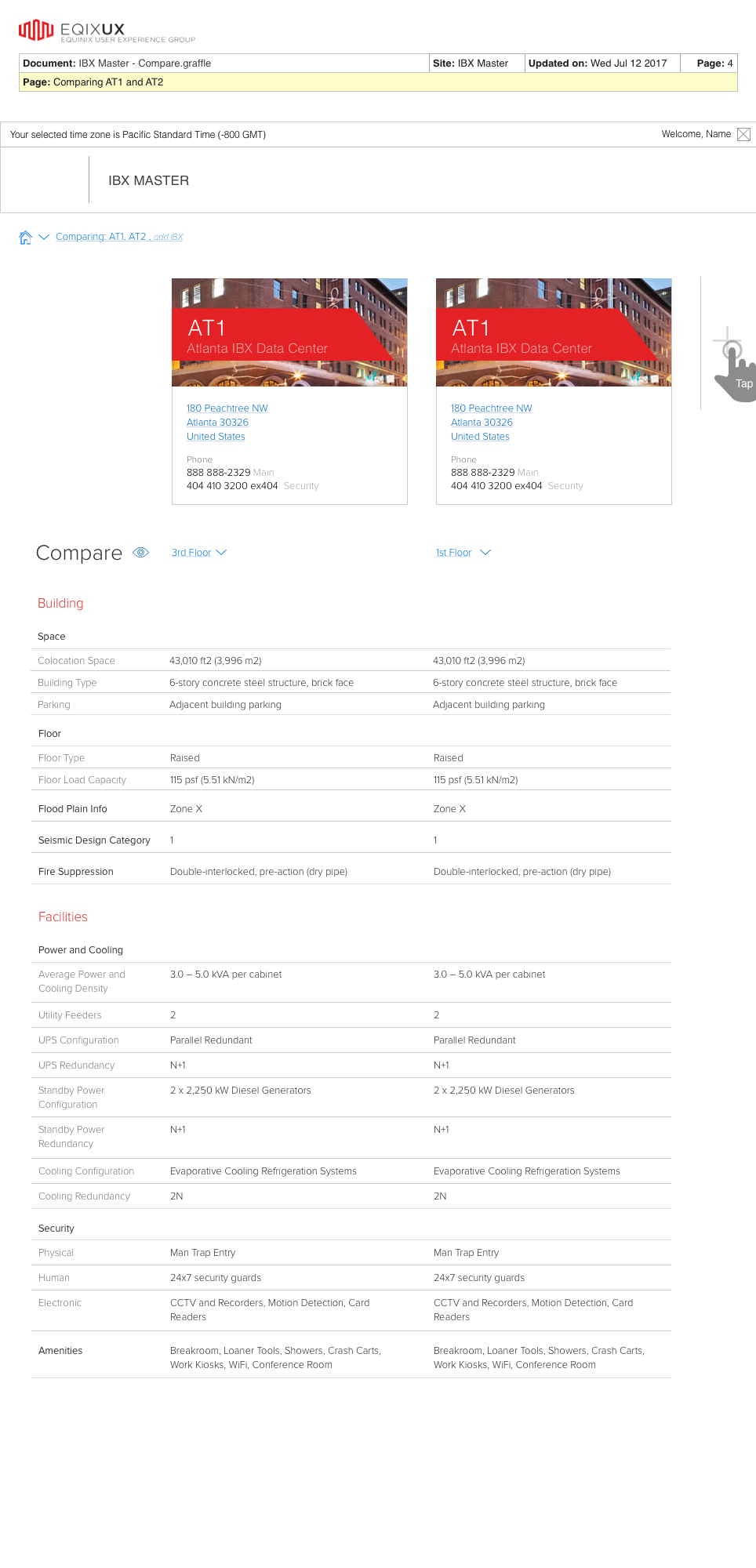
A navigation bar with only 3-4 buttons leading to mostly unfilled pages resulted in a poor user experience. Around this same time, I had a satisfying experience using a widget to pay bills on PG&E's website. I was able to simply log in, click a couple of buttons, and then log back out. There was no need to navigate to any additional pages or to click on any overlays as it was all accomplished on the dashboard. Until that time, I had been under the impression that it was poor form to allow users to complete tasks on the dashboard and to instead provide them information and links to relevant pages. As a result of my experience with PG&E's website, I moved the Compare tool, Generate Reports tool, Create New Data Center tool, and other widgets and tools to the dashboard. If a task could not be completed in such a small area, it was designated as a starting point that would lead to a full-sized webpage with all the relevant data. These changes created more time for the backend system to retrieve information while the user was still on the dashboard, thereby giving the user a snappy experience.
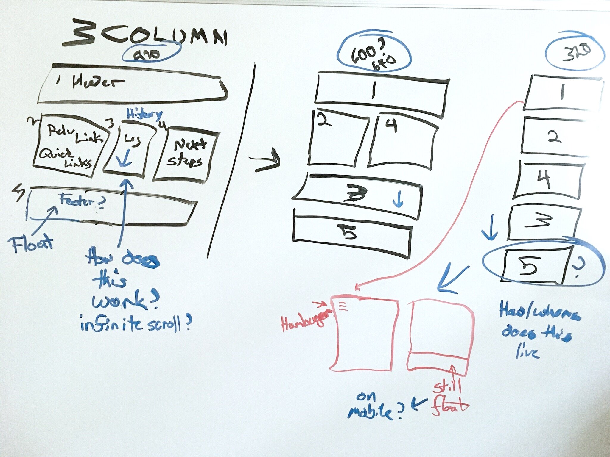
Using responsive design, this shows what it looks like when the web browser is resized.
Wireframes
These wire frames were presented in person to the stakeholders and development teams for review so the UX annotations were removed from the deck.
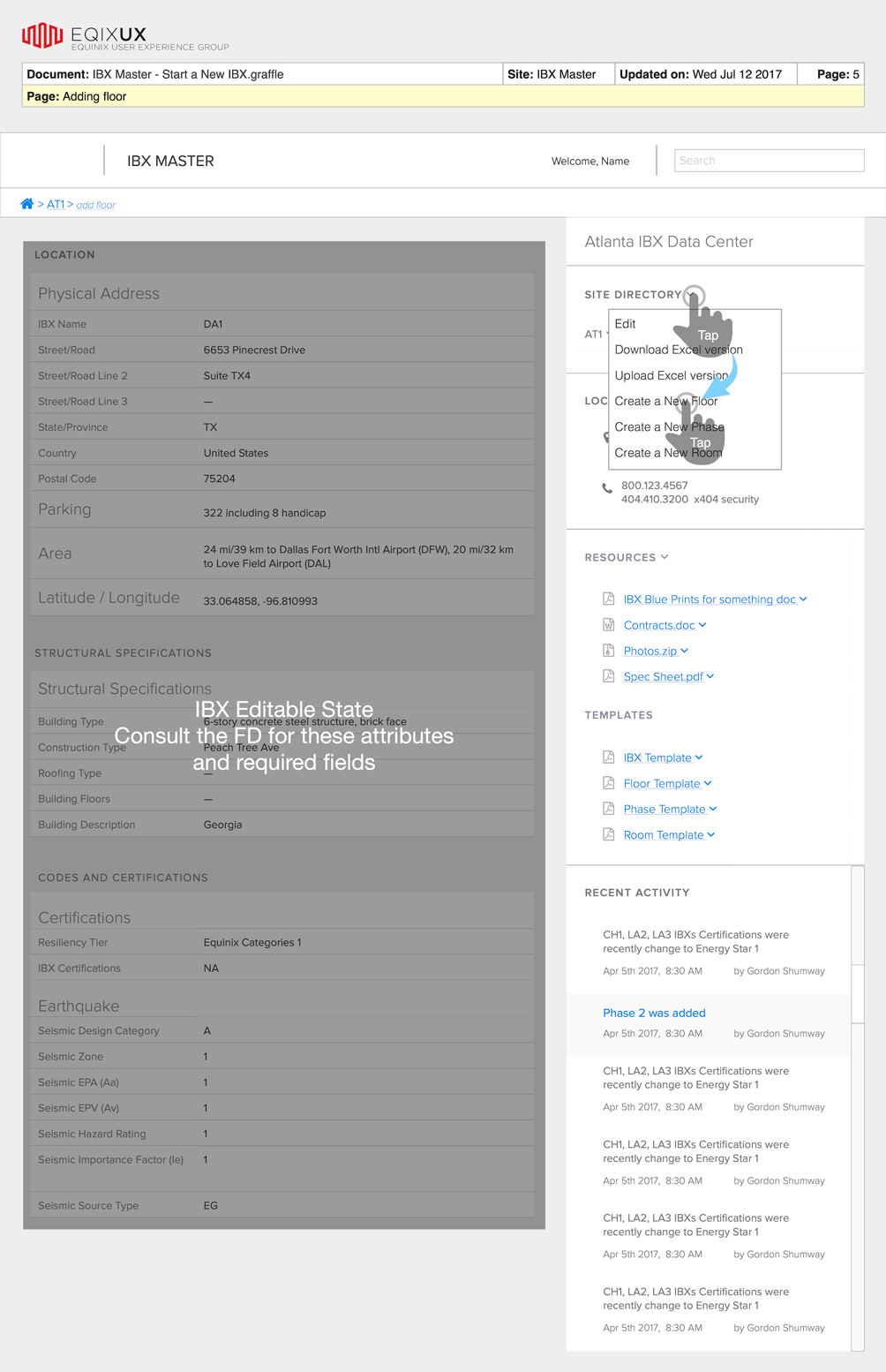
Actions & Animations
These are examples on how the interface is implemented.
Loading example (No… my portfolio is not loading something)
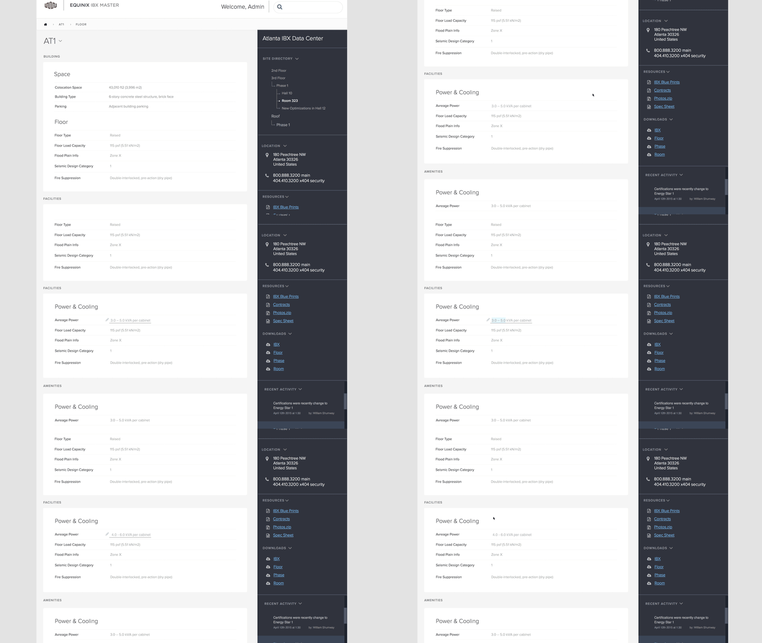
In-line editing
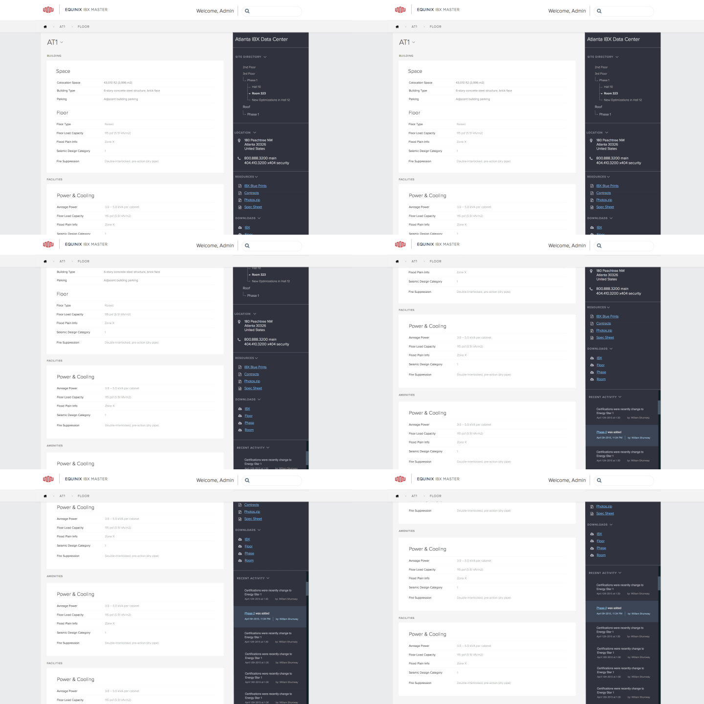
Affix scrolling
Mockups
Key Takeaways
An organization can analyze the cost vs. benefit of a thorough existing property audit in two ways. One perspective is that it generates additional time and cost because audit results surface unknown and unexpected problems. Alternatively, a business can view the user management audit as an investment that will preempt wasted resources, inefficiency, low productivity or lost customers.

