CASE STUDY
Pagination Sliders
A User Interface Study
Creating an Efficient Method to Navigate High Page Count
Overview
A company’s steadily accumulating online records or transactions can routinely number in the thousands of pages. Challenges inherent in navigating large volumes of paginated information undercut the productivity promised by computing power. Google instantly serving up several million results is the extreme example of data retrieval outrunning the ability to pinpoint. The UI lacks a pain-free approach for maneuvering to page 1,283.
This case presents a UI-based solution for navigating a large quantity of search-result pages.
Problem
The need to reach deep into the data stack of an organization that processes hundreds of records each day is more plausible than the necessity to reach page 1,283 in the Google scenario. However, even a company’s relatively smaller scale search result tends to bury the search endpoint. This is especially true when hundreds of records accumulate as identical or fairly similar, and number in the tens of thousands. Deploying multiple smart filters and sorts can still deliver thousands of results indexed on hundreds of pages.
Unfortunately, standard pagination techniques have not kept pace with the exponential progress in computing and data manipulation. The original method applied here – forward and backward arrows with five to six visible page numbers nested – gets applied broadly, with no consideration for whether the search result is a handful of pages or 1000 possibilities. There often is no easy, quick or non-frustrating path for a user to arrive at page 120 of a 300-page compilation. The only way to dive deep is using the “Next” arrow, or perhaps the “Last” arrow. In either case, taking the plunge could easily be a 60-click expedition.
Traditional pagination is unable to provide a way to arrive at page 301 without continuously clicking the “Next>” option.
Collaborative Goal
Configuring a more robust search query may seem like the optimal solution, but the result might still return hundreds of records. Adding an Ever Scroll function is an option, but the user could scroll for hours. Placing records into a sortable table is helpful, but the format still presents a user with an overwhelming number of records.
Standard pagination, meanwhile, does deserve credit for dialing back the load on Internet infrastructure servers, making traffic faster overall and reducing running cost. As a result, the objective is a solution that enables arriving at deep pages faster – using only the UI.
Design charade, mostly on paper.
Solution
An effective option is the incorporation of a “jump to page” input field to enable users to arrive at a page quickly, without repetitive page clicking. The function is simple to configure and easy to operate, but does occupy a large amount of space. This is problematic because tablets and smart phones, with their smaller screen sizes, are increasingly the devices of choice for users. The UX redesign for this organization eliminated the jump function from consideration because it occupied too much screen real estate.
The “jump to” premise is intuitively correct, but the UI takes up most of the screen page, particularly on mobile devices.
A scrubber bar or “slider” – envision the horizontal timeline used to selectively play a music file or a video – also streamlines data stack navigation. Equally important, the UI requires significantly less real estate than the “jump to” function, and is easy to navigate. Users move through the search pagination more quickly than using the backward / forward arrows. In addition, the technique gives a visual cue to the user’s location in a data stack.
Outcome
Utilizing the scrubber bar or slider for the search UI dramatically improved user experience when navigating the company’s records. Operating the UI with no instruction – and a 90% drop in the amount of time spent using pagination – resulted in numerous positive reviews on ease of use. An additional, welcome outcome: users skipped applying filters and scrolled the pagination immediately.
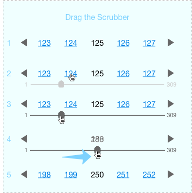
Sample of the pagination slider
Final Thoughts
The scrubber / slider solution moved the UI forward significantly. Investing additional R&D – perhaps to make the pagination method more mobile-friendly – is a productive next step.
The step-by-step process for a scrollable pagination:
Pagination at rest on page 25.
The mouse cursor hovers over 124. Notice that the scrollbar is available but de-emphasized. The user knows it is present but it is not needed to navigate.
The mouse hovers over the scrubber.
Dragging the scrubber will change the page number until the user releases it.
When the user releases the scrubber, the pagination will re-draw with the relevant page numbers.


